In one of my recent project I’ve been designing the registration form for an iOS app. Form design is a classic UI challenge – One can spend a day designing a registration form, spend the rest of the week honing it, and the rest of the year optimising it once it’s live. Form design is notoriously known for being filled with pitfalls, and in mobile forms it gets even trickier.
A simple text input field isn’t much of a cumber, but the birth date input forced me to think carefully before settling on something. There are so many ways you can design this, and as Anthony is gracefully illustrating in this article on UX Movement, not all ways are equally good.
The challenge with birth date input is that you’re asking for three related numbers (month, date and year) and we want the user to quickly grasp what they need to do (enter birth date) in what format, and finally in what order (MM/DD/YYYY in my case).
You can get away with most solutions, especially with good error handling, but naturally I wanted to offer the most intuitive and quick solution that I could find. Inspired by Anthony’s article and after playing around with some ideas it came down to four options.
The DOB form fields shortlist
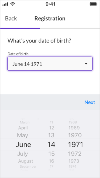
Native iOS date picker

Pros
- Native iOS component means easy to implement
- Error-safe. There is no way to enter incorrect formats
- Quick: 6 interactions (I count a scroll as 2 interactions)
Cons
- This solutions doesn’t translate to web, and need to be assessed separately in Android
- Apples’s date barrel can be a bit fiddly, but at least by setting the default values to the middle values we can minimise the total scrolling across the user base (1971 is the median year, but in all honesty I didn’t check the median month and date – note to self; check that before launch).
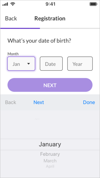
Dropdown and number fields mix

Pros
- Clear grouping and labelling of fields
Cons
- Slow: Requires 9 interactions
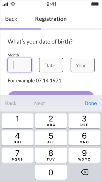
Separate number fields

Pros
- Clear grouping and labelling of fields
- Can automatically jump to next field after two digits have been inserted
Cons
- Medium Fast: Requires 8 interactions
- Creates slightly more cognitive load converting birth month to a number instead of seeing the month in text
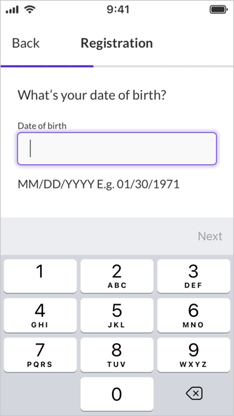
One number field

Pros
- This isn’t bad, but it has no pros against the other options listed.
Cons
- Medium Fast: Requires 8 interactions
- Creates more cognitive load figuring out the format
So which one did I choose?
Decisions, decisions. There simply is no perfect solution. As with most things design, we are problem solvers and solving a problem requires you to understand the context.
I went with the native iOS date picker. It’s easy to implement and quick to interact with (in theory), both of which work towards the success metrics for the project. This does mean that I will have to revisit this challenge when we do the Android and web apps, but at least that’ll give me a sort of A/B test against this solution and if the other solutions are performing better we can adopt that in the iOS app.
Have you any other good ways to enter birth dates? Let me know your thoughts.