I’ve been into mechanical watches for some years now. I could get lost in this topic very easily but I’ll keep it brief and to the point here.
One thing that you simply cannot avoid if you’re buying a mechanical watch is to post-rationalise your choice of mechanical before quartz (or own your emotional bias, which we rarely do – another extremely interesting topic). From a rational standpoint quartz is the better movement, period.
Already in that choice we’re seeing a strong emotional bias. The choice to pay more to satisfy an emotional need rather than a practical one is very interesting to dissect and understand for anyone involved in product design.
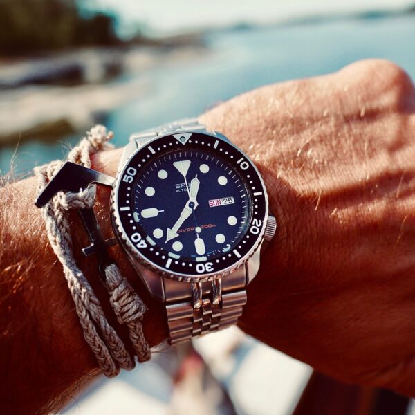
Let’s stick with the watch example but take it one step further; cult watches and collector’s items. The Seiko SKX is an ISO certified dive watch that you can buy for about £200. It’s comparatively cheap but well respected, and has gained a cult following over the years.

The interesting thing about the SKX is that on paper it’s far behind more recent models that you can buy for half the cost, yet people keep buying them while keeping the demand and price up. Seikos aren’t bought as investments, so again we see the power of emotional value.
Emotional value is everywhere
Of course the emotional value of products can be seen in any product category. Think about any iconic product that is outdated and overpriced compared with more modern alternatives:
The 70’s VW camper, original Polaroid cameras, Remington typewriters, Rock-Ola jukeboxes…
The emotional value of these things comes from the the vintage aesthetics, the tactile controls, image through association (even association with fictional characters has been proven to be big business as seen with the James Bond franchise) and of course nostalgia. Physical products naturally lend themselves to these attributes, but with digital products it’s a different story.

Tactility goes out the window, there is little image and halo effect to be fetched, and vintage computer graphics would be charming at best. There is however the nostalgia factor, especially in old computer and video games – but it’s not a true comparison since although it’s outdated, it still offers a unique experience.
A remake of the 1996 cult RPG Final Fantasy 7 was released this year, and if the game’s story and mechanics are true to the original I think we could find an answer there – Would you choose the original over the remake, despite its outdated graphics and sound? If yes, we might have stumbled upon the same emotional value that we see in the Seiko SKX and other physical products. Carolyn Petit wrote an insightful piece on it on Polygon.com
Emotional value in digital utility products
Video games are easy though – we rarely play them for a rational purpose. And I don’t design them anyway. I’m more interested in capturing the emotional value, if possible, that could exist in an old version of Outlook, or Photoshop, or Amazon.com.
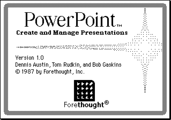
Would anyone ever prefer to use a Powerpoint from 1987 if they could? I’m struggling to see it happen. Obviously we’d have to overcome outdated performance and potentially poor usability, so the emotional value would really have to be big. The only possible reason here would be nostalgia. Maybe it reminds us of our first job where we had a crush on the office assistant.

Brand loyalty can go a long way, and you may want to stick with a brand even when their product becomes obsolete, simply because you like the company behind it. But even that has to give at some point in the fast moving digital world.
Physical and digital are different
Physical products have both intrinsic and extrinsic emotional value. Bob drives his Land Rover Defender because it aligns with, and strengthens his self-image of being adventurous, but also because of the status and image it communicates to the people around him. He also tells himself that the four wheel drive and low-end torque is very useful if he would ever have to go off-road and climb steep hills.
I’m struggling to find a similar phenomenon in digital. Linda isn’t using Firefox instead of Chrome because of its emotional value. It’s pure functionality, or more likely old habit. We’re not using digital products to communicate style and image, and working with a two dimensional medium removes the joy of tactical interaction.

Design for delight
If we are to find emotional value in digital products it has to come from the intrinsic value of delight. We have to design products that are so delightful to use that we’re willing to sacrifice some features or performance if needed.
I believe this can be done in very basic products. For more complex tasks, the rapid development of technology will make old products obsolete and we have no choice but to keep up.
Adobe Flash used to be the new kid on the block both for development and display of web sites. It was the coolest thing and offered unlimited creativity for your websites. As much as we loved using it and all he hours we invested in it, I don’t think anyone has used Flash to build websites for a very long time.
Instead, let’s look at basic products doing one thing really well while adding moments of delight for the user. A to-do list for example needs to do one thing well, and the introduction of new tech doesn’t need to interfere with that. Any.do was delightful to-do list app and exactly what I wanted back in the days. It’s still good but does too many things now – sometimes it’s not tech that interferes with your product.
The more delightful moments we can create for our users, the more likely our products will stand the test of time. What was the last moment of delight you designed for your users?