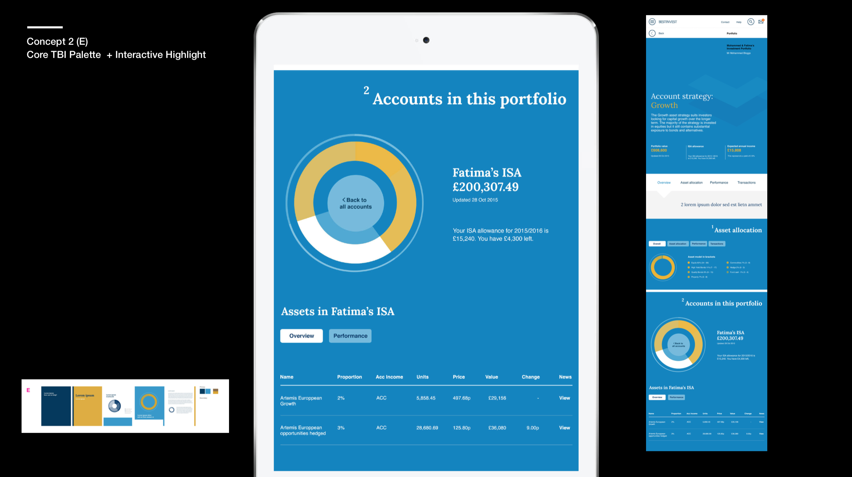
Wealth management portal for Hight Net Worth Individuals
BRIEF
Design Tilney’s wealth management portal. The goal is to increase client engagement and encourage High Net Worth Individuals to adopt digital to complement face to face services.
DATES
Oct – Dec 2015
INDUSTRY
Fintech
CLIENT
Tilney via Splendid Unlimited
MY ROLE
Lead UX designer. My responsibilities included project planning for the UX deliverables, providing steer on design decisions, and doing hands-on research and design work.
Background & Team
Tilley have invested heavily in bringing their services online. This will align them with client expectations, automate many of the daily tasks, and improve communication with their clients. Splendid was asked to design the client facing, responsive web portal based on a set of predefined functional requirements.
The requirements were based on customer research and stakeholder interviews carried out prior to Splendid’s involvement.
Our team, consisting of two UX designers, two visual designers, one front-end developer and one project manager, worked closely with the project members from Tilney to turn the requirements into a fully defined user interface ready for implementation.
Unsderstand phase
The functional requirements were enough to start thinking about sections and content, but it didn’t express the needs of the users in detail, and who we were designing for.
Understanding that there was a gap in our knowledge, we kicked off an understand phase to create a foundation upon which our design decisions could rest.
Ideally we would’ve talked to Tilney’s customers to better understand how they would see the portal being a part of their lives. Unfortunately we didn’t get access to their customers, so instead we conducted a set of interviews with their financial planners and investment managers.
It turns out they had a pretty good understanding of what their clients would want (and we had to take their word for it) since they deal with them more or less on a daily basis, and there were some strong trends in what people were looking for.
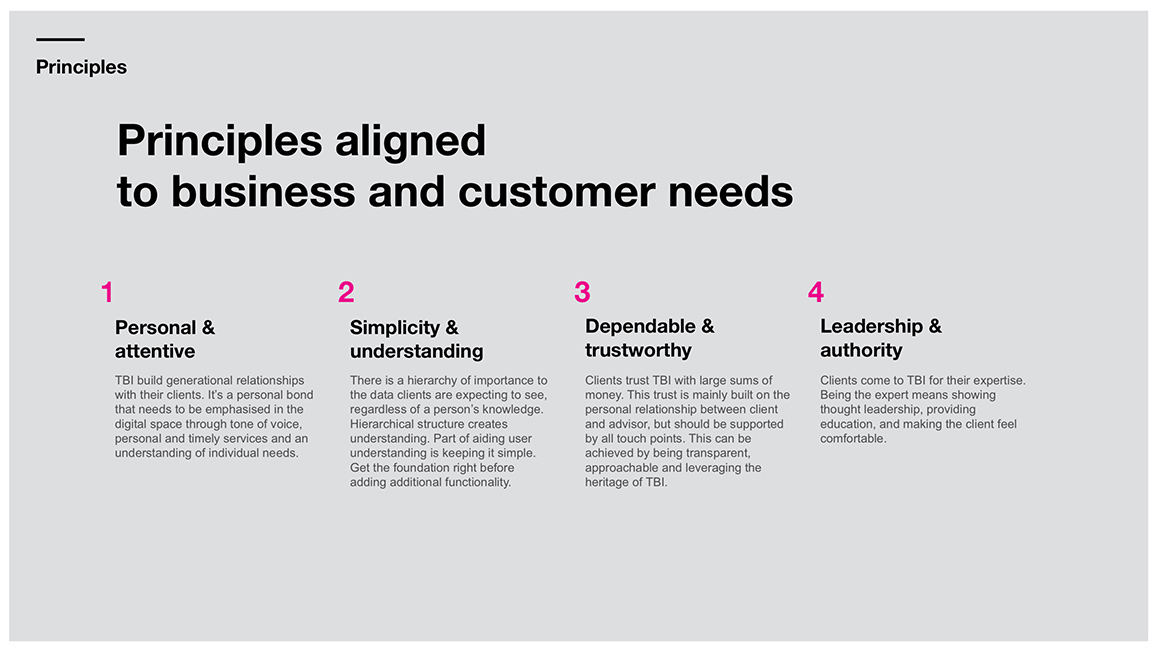
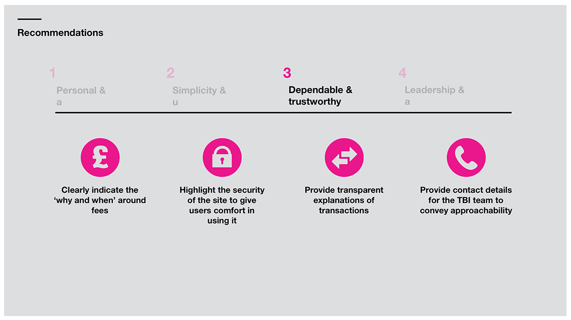
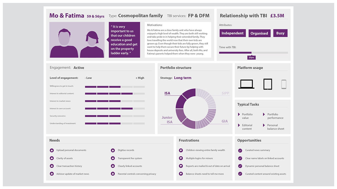
The understand phase generated a set of design principles, and three personas that we felt covered the majority of behaviours and needs. These were confirmed with Tilney’s team who agreed that they indeed felt realistic.
Concept phase
With a better understanding for what kind of experience we needed to design for, we moved into the next phase.
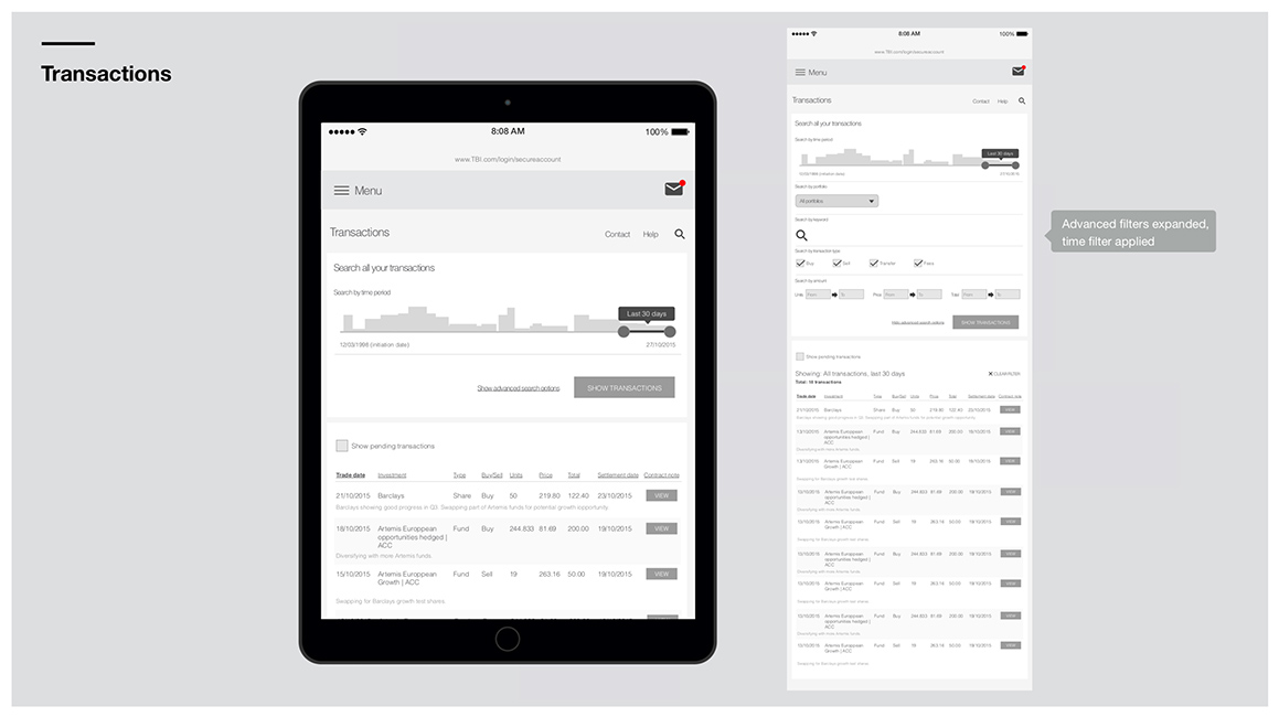
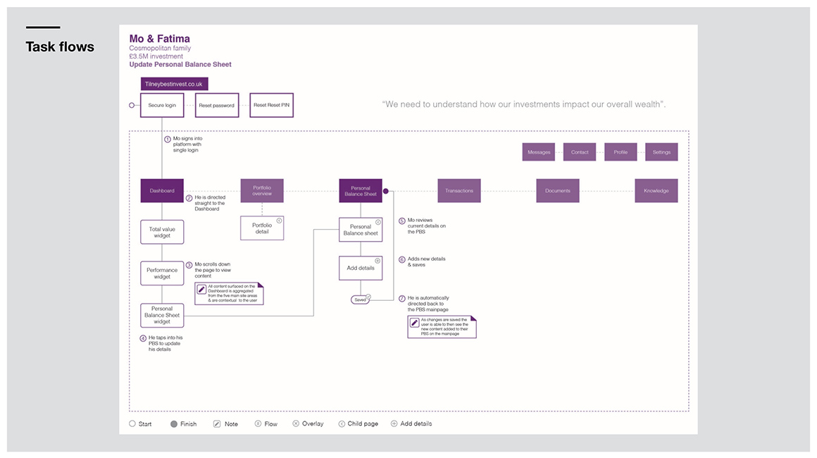
We sketched out the information architecture, key user journeys and various concepts of key pages. Based on our personas, we also made the tactical decision to design tablet first, as this would be a common screen for our target users, and could also be used in face to face client meetings.
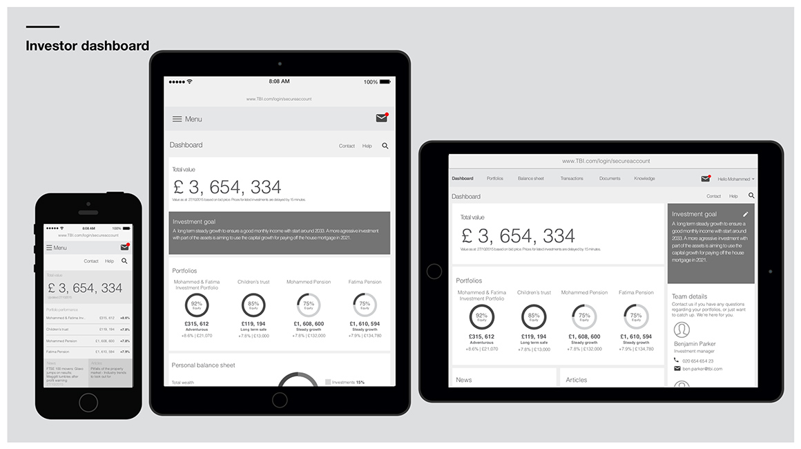
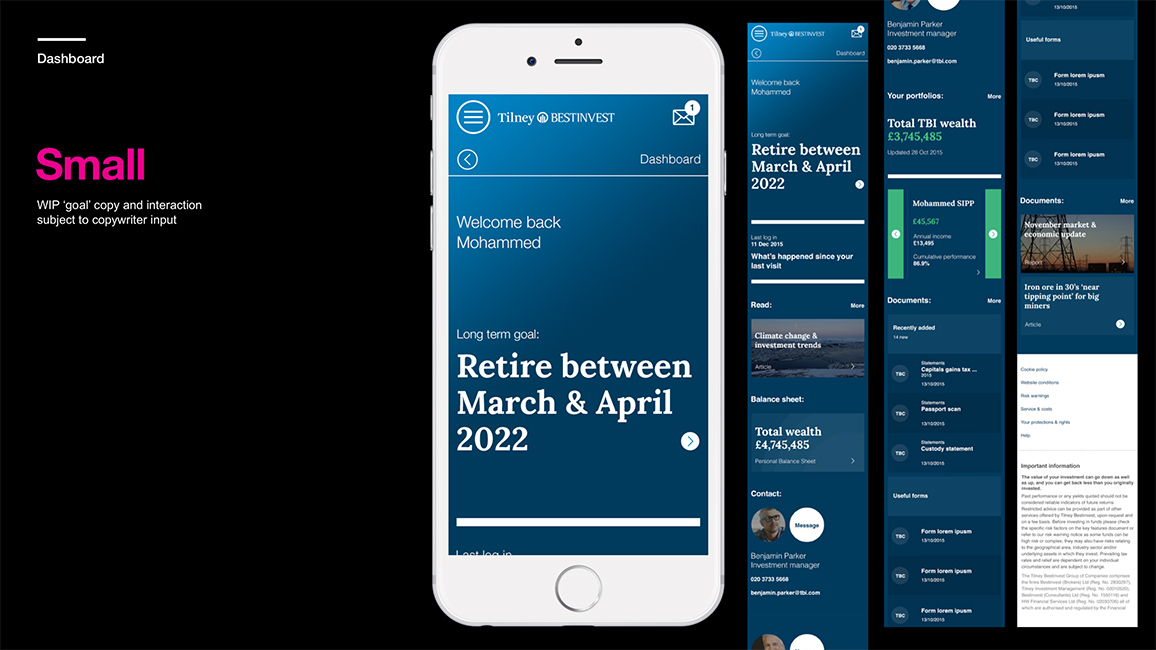
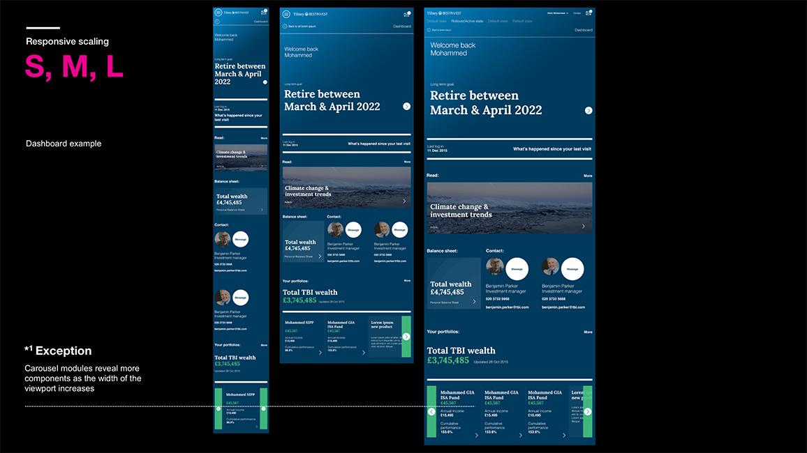
As we interpreted the requirements into a sitemap we quickly realised the size of the portal. There were quite a few sections and sub-sections needed to cover it all. Because of the breadth and depth of the site, we used a dashboard approach with dynamic nuggets of content being surfaced on the start page.
Dashboards are all about showing the right information at the right time. Luckily, Tilney’s new platform could handle push messaging, alerts and behaviour driven content, which meant that the dashboard, and the service itself, could be used to its full potential.
Designing for engagement
Tilney’s client portal was a big step towards digital self-serve. The high net worth individuals that form Tilney’s clientele trust Tilney with their wealth, and not surprisingly many of them are very engaged in the management of their funds.
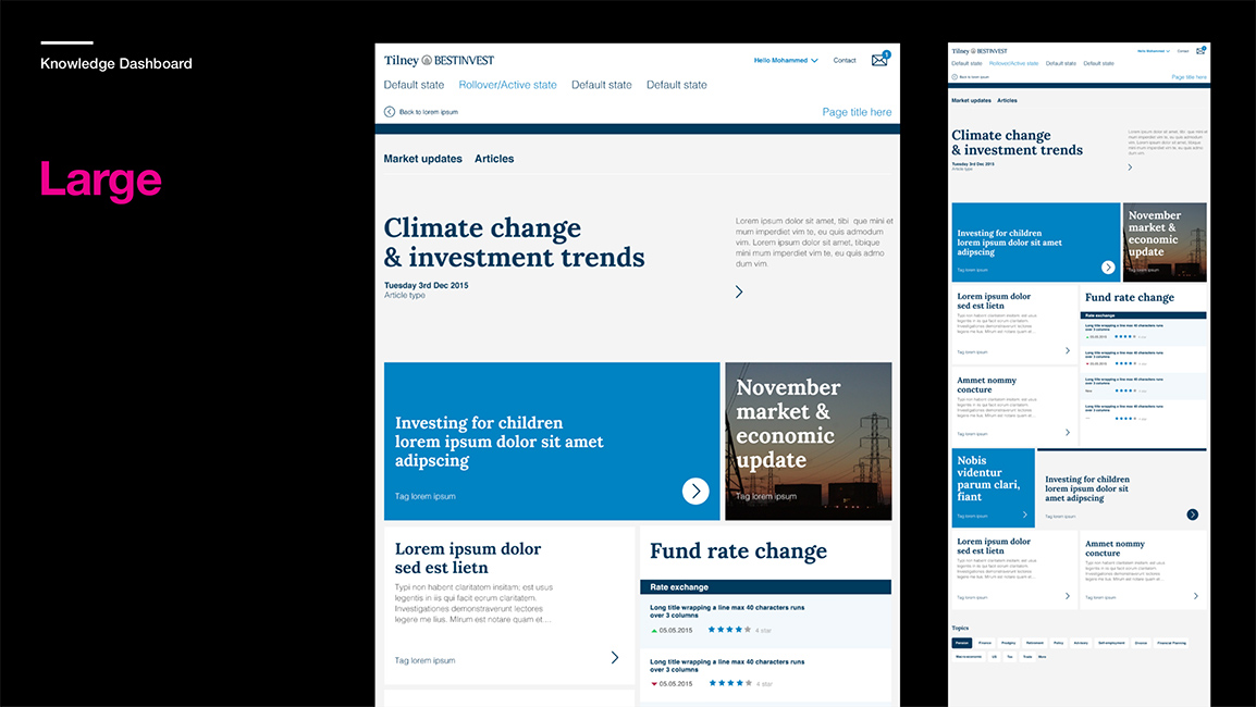
The financial planners would deal with hundreds of phone calls every week, and whilst the personal relationship is paramount, a lot of the calls relate to very basic queries that the clients could easily find the answer to with the new portal in place. There was also a big opportunity to inform and educate the more investment-savvy clients through the platform’s news and blog articles.
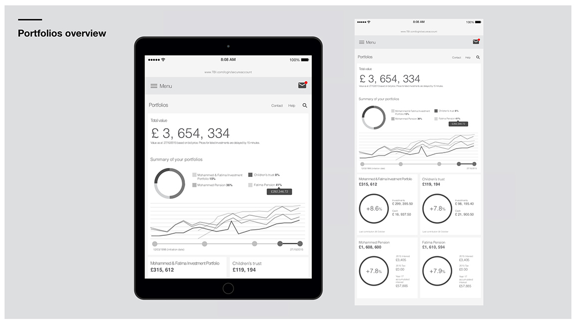
Although clients can’t execute trades on the platform, they can study every single transaction executed for them. This posed an interesting dilemma: the clients asked for performance status up-front, but Tilney stressed the importance of playing down short-term performance and focusing on the long-term goals the clients set up in agreement with their financial planner.
Because of this, we agreed to lead with the clients’ goals rather than fund performance, which would’ve been a more intuitive decision. This way the client would always be reminded to keep their eyes on the prize and not get tempted to reach out to their investment manager every time they saw a red, down pointing arrow on the portal.
Delivery phase
With the sitemap, navigation and key screens signed off we could move into designing and documenting the rest of the pages.
The visual design exploration had also matured into a style the designers could start applying to the wireframes as they got done and signed off. Every week we had a sign-off meeting where we showed the progress to Tilney.
I found that the best way to communicate the designs to the team was in a click-through prototype made in InVision. This also turned out to be a popular presentation tool that Tilney used with their internal stakeholders.
In this final phase we worked closely with both Tilney’s domain experts to get all the functionality and content right, and with our visual designers and developer to iron out all the details in the interactions.
The whole site was finally documented in annotated wireframes and a visual style guide, and built in HTML5 and CSS before handed over to Tilney.
Retrospective
We had to trust the domain experts a lot on this project, and quite often their opinions wouldn’t even align among themselves. It shows the importance of our role as voice of the customer, and having data to back up arguments with if you need to stand your ground.
It’s easy to feel humble when talking to experts in an area you now little about, but one should never forget that we’re experts too and we’re getting paid to bring that expertise to the project.
