Late last year I received an invitation to try out and review Mockitt, a UI prototyping tool. I had never heard of it before, and judging from the eminent and annual UXTools survey, it wasn’t picked up by the masses either.
I have to admit I’m having a hard time keeping up with the latest tools. I stick with tried and tested industry standards, just enough up to date to fit in with most design teams I join as a contractor.
My personal experience aligns well with the UXTools survey when it comes to tools used for UI design and prototyping. To no-one’s surprise, Sketch, Figma, Invision and Adobe XD currently reign over the UI domain (at least in North America and Europe).
So where does Mockitt fit in in all this? I found a couple of reviews.
Tiffany Goh on Medium
Chuck Rice on Medium
Connection Cafe
It seems that Figma is the most commonly used benchmark when trying to understand where Mockitt fits into a designer’s workflow. Maybe that makes sense, I haven’t tried Figma’s prototyping capabilities enough to say. But in my mind, Mockitt is much closer to Axure than anything else I’ve seen.
Mockitt or Figma? I say Mockitt or Axure.
Maybe Axure has lost a bit of popularity in recent years, but it’s been a long standing favourite of the UX old guard in the UK. When it comes to building interactive prototypes it’s extremely powerful, without getting too bogged down in scripting and code.
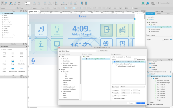
From my initial mocking about (no pun intended), Mockitt doesn’t have the scripting possibilities of Axure, but it shares the same approach of states that Axure has built into its ‘Dynamic panel’ component.
Thanks to states you can create interactivity and dynamic pages. You don’t have to create new pages for every single interaction, as you would in Invision or Sketch for example. If you’re trying to do anything beyond simple click-through prototypes this is a godsend.
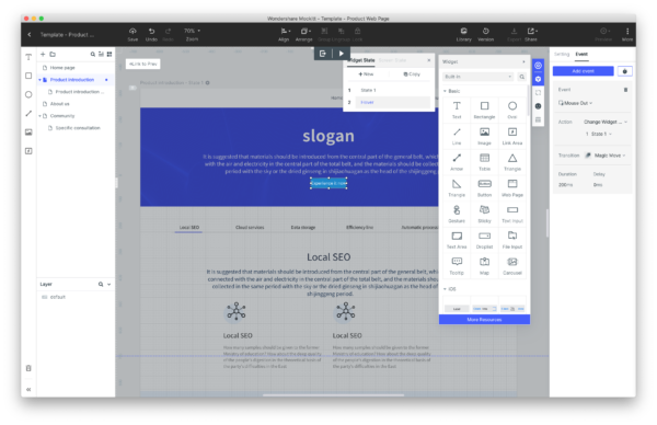
Mockitt is a prototyping tool
Just like some designers do wireframes and design in Axure, you can go from idea to prototype in Mockitt alone. The tool comes with drag and drop components from common UI frameworks like iOS and Android, so you could easily build a complete UI for mobile, desktop or other platforms. But it’s not a UI design tool like Sketch or Figma. As with Axure, you’re quite limited in making beautiful, bespoke UI elements from scratch. It’s not a tool for production design.
Will I use it?
For years, my workflow has been Sketch + Invision, or Axure, or sometimes even Sketch + Axure. Mockitt could replace Axure, but from what I’ve seen it falls short if I want to build a heavily dynamic and interactive prototype. Apologies if I’m wrong – I haven’t dug very deep in my analysis.
How does it compare in pricing?
Here’s the thing. I own a license of Axure RP 8. It was a one-off purchase. Axure RP 9 is a subscription service, and so is Mockitt. Annually $300 vs $69. If I were to subscribe to one of these today, the much cheaper price tag on Mockitt is compelling unless I severely need the unique features of Axure.
But for $144 a year you can get Figma, which offers both design and prototyping. If you need a tool for production design to complement your prototypes this would be a better option. Or you can buy a one-off Sketch license for $99 and use it with Invision for $156/year.
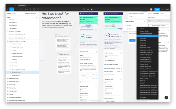
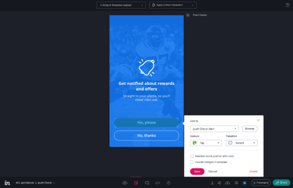
There are of course other factors to take into account. Collaboration, version control, compatibility with other tools, plugins, dev handover etc. What’s right for you and your team will eventually come down to your unique needs and preference.
All these tools; Sketch, Figma, Axure, Invision and Mockitt offer free and trial versions, so the best thing to do if you’re looking for the optimal tools for your workflow is to give them all a go, using a real world project to stress test all scenarios.
figma.com
sketch.com
mockitt.wondershare.com
invisionapp.com
axure.com
