UI designers, do you need to shift focus in 2021?

Various stimuli made me think about the topic of staying relevant. The key contributor, I think, is the constant reminder of how highly valued a glossy surface is. A slick and modern UI will get the votes in 2020 (instead of the insights and process that should proceed it). The problem is that anyone can design a slick and modern UI in 2021.

But first, some history.

Being a UI designer in 2001

The craft of UI design was hard in 2001. Most of the time it was a matter of applying usability and creativity (ever so stifled) to a medium that had limited styling options. It was a constant struggle of making the most of small screens with pixels large enough to detect on screen. To our help we had Photoshop, which wasn’t made for UI design but worked well enough to still be used to this day by some UI designers. And there was Flash, of course, for when you needed something more Flash-y so to speak. Flash was eventually abandoned as a development environment, but I still used it for prototyping from time to time simply because there wasn’t much else available.

Being a UI designer in 2011

Fast forward ten years, and things had gotten arguably even harder in 2011. By now, web and app front-end technologies had caught up. As designers we weren’t limited to basic web technologies for outputting our ideas. The evolution of web browsers, Javascript, CSS and webfonts all allowed us to mock up some serious design concepts and actually build it. If you saw an interesting layout in a printed magazine you knew you could replicate it, and add layers of transitions and interactions to boot.


With technology not holding you back any more, you had to become a better designer (restrictions are wonderful for problem solving, but you don’t push the envelope visually – and when someone does, you can easily tell whether they’re up to snuff or not). On top of that, the iPhone had given us a completely new paradigm of touch screen interactions to consider, and responsive web had just started to emerge. We had our hands full, but our design tools hadn’t evolved much other than updated versions of  Adobe CC and early versions of Axure and Sketch (I didn’t get introduced to Axure until 2013, and Sketch in 2014).

Being a UI designer in 2021

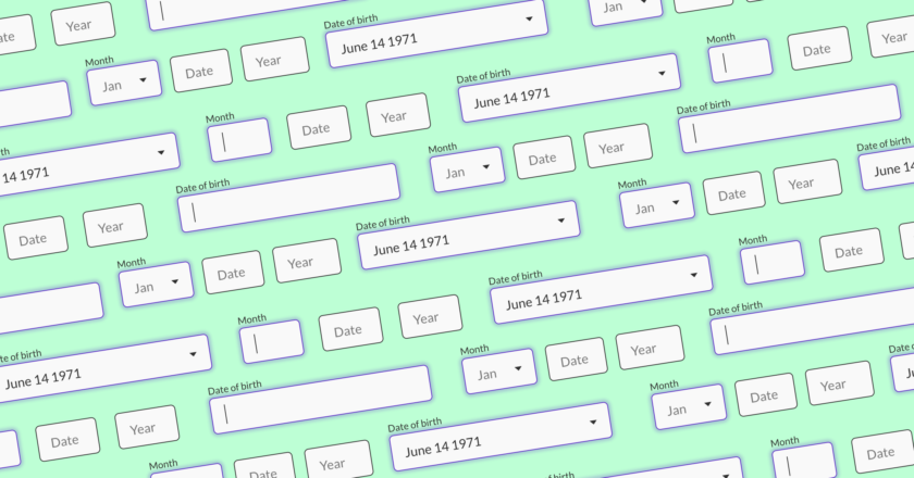
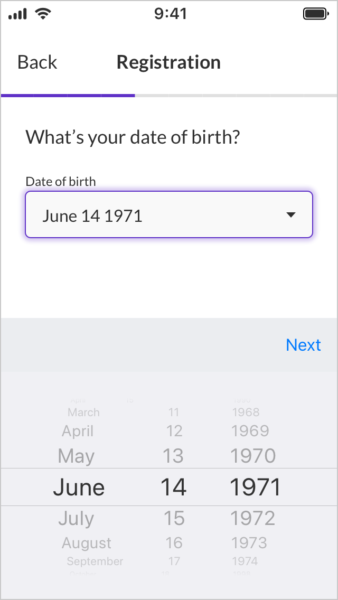
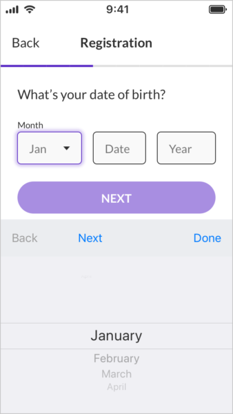
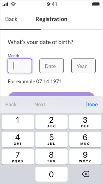
But in 2021, the craft of UI design is not hard. You still have to have the basic principles on point, but with so much inspirational content out there it’s every junior designer’s right and necessity to copy and steal until they have a good understanding of what works and what doesn’t (don’t get me wrong, this still takes years). UI design tools have exploded and long gone are the days when you had to Google tutorials for “how to make a gradient mask from 0 to 100 opacity”. We design with vectors and %. We have pre-sets and templates. We have tools built for purpose; for designing, prototyping and handing over.


UI design have had time to mature. Design systems and best practise guidelines have been refined over the years, and you can pretty much use a plug’n’play bootstrap UI or WordPress template and trust it will work (albeit not score any points for uniqueness, but who cares unless you’re a design agency pitching for work?).

A prediction that has been mentioned many times before

So where does that leave experienced senior designers and budding juniors alike? This is where my prediction comes in, which in fact has been told many times before.


GUI design, as in putting together graphical elements on a canvas to allow a user to accomplish goals, is becoming less and less of an artisan craft.

The steps from idea to wireframe to production UI are getting more and more automated. Anyone can download Figma and use a design library to put together the screen designs. The tools are intuitive to use and the design choices are built into the design system. You can have a perfectly fine ‘good enough’ solution and little is left for the UI designer to do.


The playing field is getting crammed with self-taught bedroom designers, ambitious product owners and even machines (close but no cigar). It’s time to find new ways to stay relevant and add value in the product development chain.

How to add value as a designer in 2021

Do you feel threatened by the competition? Have you noticed a trend of clients expecting more for less? If so, there are a number of ways you can hone your design profile to add value.

Go beyond ‘good enough’

Remember what I said about ‘good enough? Some clients appreciate the craft of GUI design, others think it’s just a matter of aesthetics and personal preference. Do yourself a favour and walk away from the latter. Find clients that understand the value of good design and offer them exactly that – thoughtful, bespoke, accessible, scaleable and on-brand. You need a stellar portfolio showcasing understanding of layout and typography, and a flair for motion and interaction design.

Branch into UI architecture

In my mind, all UI designers should have architecture skills. This is what makes them product designers rather than visual designers. Since our industry has decided to split skill sets into UI and UX, this is often not the case. Creating design hypotheses, defining user journeys and information architecture are tasks of a UI architect (some call them UX designers). If this can be done by the same person that creates the production UI, all the better. Less Chinese whispers and less overhead.

Become a UI developer

You already know how to design a pixel perfect UI, and you probably know about the technologies that will build it. Why not go back to school and learn how to use those technologies? To be able to design and build a UI to a high standard is still a very lucrative skillset and opens up doors to both high paid jobs, and the possibility to put any side hustle you can think of in motion. I thoroughly admire good designer/developers, and they are not common. You need to be aware of a boatload of tech in 2021 – but it can be done if your motivation is high. And most tools and knowledge are out there for free.
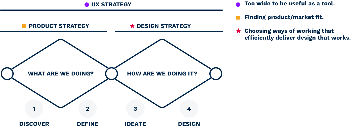
Get strategical

Strategy is evergreen. It will always be needed to gain the upper hand. In a previous post I separated product strategy into its own practise (user research, business requirements, product/market fit). I also defined design strategy as your approach to design – choosing the methods that help you choose a design track.

If you’re a design lead you can have massive impact on both efficiency and outcome with a solid design approach. This is then amplified by the number of designers adhering to it. Closely paired with design ops, design strategy becomes the conductor that orchestrates the design efforts into an integrated part in the larger product development machinery.

Become a design facilitator/manager

If you’re ready to step away from your hands-on role, you might want to become a facilitator or manager. These two roles are often performed by the same person i.e. the head of design or similar. But there’s a big difference in the two. A manager has direct reports and HR duties, for which you need a list of soft skills no one asked of you as a designer.


As a design facilitator your role is rather project managing on operational level. Your role is similar to the Agile scrum master. You remove hurdles and allow your colleagues to get on with work in the most efficient way. A facilitator defines the team’s design ops procedures. This means making sure that the team is properly integrated with the other teams, so that input and output is frictionless.


There will always be a place for slick and modern UI design. The issue some designers are going to face is the perceived value of it when it’s becoming more and more accessible. My recommendation for those designers is to make 2021 the year where they add skills that can’t be easily automated to their skill set.

Form fields illustration

Birthdate mobile form fields for iOS

In one of my recent project I’ve been designing the registration form for an iOS app. Form design is a classic UI challenge – One can spend a day designing a registration form, spend the rest of the week honing it, and the rest of the year optimising it once it’s live. Form design is notoriously known for being filled with pitfalls, and in mobile forms it gets even trickier.

A simple text input field isn’t much of a cumber, but the birth date input forced me to think carefully before settling on something. There are so many ways you can design this, and as Anthony is gracefully illustrating in this article on UX Movement, not all ways are equally good.

The challenge with birth date input is that you’re asking for three related numbers (month, date and year) and we want the user to quickly grasp what they need to do (enter birth date) in what format, and finally in what order (MM/DD/YYYY in my case).

You can get away with most solutions, especially with good error handling, but naturally I wanted to offer the most intuitive and quick solution that I could find. Inspired by Anthony’s article and after playing around with some ideas it came down to four options.

The DOB form fields shortlist

Native iOS date picker

Native iOS date picker UI.

Pros

  • Native iOS component means easy to implement
  • Error-safe. There is no way to enter incorrect formats
  • Quick: 6 interactions (I count a scroll as 2 interactions)

Cons

  • This solutions doesn’t translate to web, and need to be assessed separately in Android
  • Apples’s date barrel can be a bit fiddly, but at least by setting the default values to the middle values we can minimise the total scrolling across the user base (1971 is the median year, but in all honesty I didn’t check the median month and date – note to self; check that before launch).

Dropdown and number fields mix

Mixed input date of birth form fields.

Pros

  • Clear grouping and labelling of fields

Cons

  • Slow: Requires 9 interactions

Separate number fields

Separate input date of birth form fields

Pros

  • Clear grouping and labelling of fields
  • Can automatically jump to next field after two digits have been inserted

Cons

  • Medium Fast: Requires 8 interactions
  • Creates slightly more cognitive load converting birth month to a number instead of seeing the month in text

One number field

Single field DOB input UI.

Pros

  • This isn’t bad, but it has no pros against the other options listed.

Cons

  • Medium Fast: Requires 8 interactions
  • Creates more cognitive load figuring out the format

So which one did I choose?

Decisions, decisions. There simply is no perfect solution. As with most things design, we are problem solvers and solving a problem requires you to understand the context.

I went with the native iOS date picker. It’s easy to implement and quick to interact with (in theory), both of which work towards the success metrics for the project. This does mean that I will have to revisit this challenge when we do the Android and web apps, but at least that’ll give me a sort of A/B test against this solution and if the other solutions are performing better we can adopt that in the iOS app.

Have you any other good ways to enter birth dates? Let me know your thoughts.

Where in the design process are we? – Questions to ask yourself to pin down where you are and what to do next

‘Where are we?’ is not only one of my favourite tunes – It’s also a good question to ask ourselves when we join a new product development project.

You know that illustration of the design process as it really is; the one that turns a straight line into a tangled piece of yarn? It’s kinda like that when you step into a new project, trying to work out what the brief is really about and how you can best support the project goals.

Illustration of a messy design process.

It can be quite stressful knowing that it’s up to you to define the design plan but at the same time not be sure about the next steps.

Are the project success criteria clearly defined? Do you have validated and up-to-date user insights? Are there technical constraints you need to be aware of? Is the problem statement even the right one?

I find it useful to take my bearings by asking myself a set of questions when I join a new project. The answers can then help me pin down exactly where we are in the product life cycle and design process, thus informing me of next steps.

My design process – The double diamond

The double diamond has been embraced by the product design community wholeheartedly since it was introduced by the British Design Council in 2004. It wasn’t revolutionary, didn’t introduce anything new and designers had been using variants of it way before it was articulated in its current shape. But it gave us a name and a neat model that is easy to understand and tweak to our needs.

Double diamond design process

Using this ideal design process as a map for the project at hand, I can use the following set of questions and answers to understand where we are, and thus what we need to do next.

The design process is a model, obviously, and often far from what reality looks like. It may seem a bit too theoretical to be practical in the field but I have found it very useful to give structure to rather chaotic projects – over time it has become the lens I apply to any design brief I’m given.

Questions to ask at the beginning of your new design project

Is this a project? If not sure – Does the project have SMART goals?

Yes: Good, you’re off to the races.

No:
The double diamond design process is not the right tool.

In order to put yourself on the process map, the very first thing we need to establish is that you’re part of a project. The double diamond design process is project-led, so if you’re joining a team tasked with maintaining a design system or run designOps, that’s going to require a different process. This is probably quite easy to detect, but if ever in doubt wether this is actually a project, simply map your duties against SMART objectives and if it doesn’t add up your work isn’t project-led.

Do we know what problem we’re solving (or opportunity we’re chasing)?

Yes: At least you’re not in the 1st quarter of the design  process.

No:
You are at the very beginning of the process and need to create a problem statement or project objective.

In my double diamond the first diamond refers to product/market fit. Others simply define it as the discovery or research phase. Either way, the first diamond is about answering the WHAT, and the second diamond is about the HOW. That’s a great clue right there and I use it all the time if I’m unsure.

If your brief is “Design this app that is like Tinder for dog owners” you can pretty much rip off Tinder and have a pretty nice design done in a short time. But if the answer was ‘no’ to the question above, you know there’s work to be done in the WHAT diamond.

This is not always what the client wants to hear, but challenging the brief and pushing for a solid product/market discovery phase is sometimes needed and will help the project in the long run. Of course, the client pays your bills so know when to stop being an idealist and find a compromise if needed.

Do we (really) know who we are designing for?

Yes: You can start exploring solutions in the HOW diamond.

No:
You are in the 1st or 2nd quarter of the design process and should gather or synthesise user insights.

In our dog owner Tinder example you would’ve been excused for thinking it’s a shit idea. But maybe the product owner hands you some convincing market trends that points towards a real opportunity.

If we don’t know what the USP is (or wether our users actually value that USP), or don’t have a better persona than ‘Dani the dog owner’, you have some user research ahead of you. A design decision should always be a response to a verified hypothesis about your users. This is called hypothesis-driven design and it’s the bee’s knees.

Do we trust the accuracy of the user insights provided?

Yes: You can start exploring solutions in the HOW diamond.

No: 
You can either redo the user research in the WHAT diamond, or do a mini discovery before you enter the HOW diamond.

Quite often I find myself brought into a project at the beginning of the HOW diamond, only to find that the user and market insights given to me aren’t up to snuff. What was handed to you as a set of personas might’ve been user profiles based on the stakeholders assumptions of the user. What was claimed to be user behaviour based on usage data might not be applicable if you’re entering a new market with the new design.

In this case it’s highly unlikely that you’ll get the time and budget to redo the research phase, but you should at least highlight the issue with missing or false insights and decide best way forward together with your team.

Are all relevant hypotheses about your users answered?

Yes: You can start exploring solutions in the HOW diamond.

No: You can either redo the user research in the WHAT diamond, or do a mini discovery before you enter the HOW diamond.

Similarly to the question above, you might find that after doing a hypotheses exercise you don’t have the answers to design-critical assumptions. Spend some time filling the gaps best you can before going into solution exploration. This doesn’t have to directly include users if that’s too much of an ask. You can also go through customer feedback logs, look at analytics data and talk to stakeholders and subject-matter experts.

Do we know how we are solving the problem (or realising the opportunity)?

Yes: You’re in the final quarter of the design process, with focus on production and testing.

No: As long as you know what and for whom, you’re ready to explore options.

This far into the process it’s usually easy enough to know what’s going on and what needs to get done. Blockers and friction here is more likely related to the designOps in place; i.e. your tools and processes for producing, testing, signing off and handing over design.


A good process is paramount for efficient product development. Unfortunately, humans are a messy bunch. When we are put together in large companies with layers of sub-cultures within, we often get a cocktail of conflicting interests, ideas and values pulling the project in all directions.

This is probably why I’m often overwhelmed in my first days in a new large scale project. Things aren’t always straight forward, and we simply have to make the best of the situation and find a way of working that contributes most towards the end goal.

Stay calm, ask questions and figure out what needs to get done. I believe that’s a good way to keep your client happy and your stress levels down.

What is UX strategy? An attempt to decipher something that shouldn’t need deciphering

If you ask a UX professional what UX strategy is, you’d get answers as widely spread as hippo poo, of which the majority would be vague. Why? Because strategy is a confusing catch-all phrase, but still we want to include it in our skill set. Because it’s expected of us:

In any project in which you work as a UX designer, it is fundamental to start by drafting a solid strategy.

Jerome Kalumbu

I’m guilty of this; calling myself a design strategist but secretly hoping no one would call me out on it. If someone did, I would probably say something about defining the right approach for the target audience. That isn’t wrong per se, but what was missing was a clear definition of strategy, and the methodology to execute it.

To redeem myself I picked up one of the top-rated books on strategy and started to educate myself. Actually, the very first thing I did was to google ‘UX strategy’ but what I found was more confusing than helpful since everyone got their own take on it. Some say it’s a business strategy, others call it a plan, and if you look somewhere else it’s an alignment of the product vision with its users.

I don’t mean to bash these definitions in any way – in their own context they make perfect sense. But with so many answers out there, the only thing I could do to truly own the topic was to dissect it and shape my own opinion. So, based on the definition of strategy in the book Good strategy Bad strategy by Richard P. Rumelt, I did my best to really understand how I can use strategy in product design without the risk of losing face.

Strategy is a 3-step process

‘Strategy’ is a bit like ‘UX’; it gets thrown around a lot without much thought of what it actually means. Good strategy requires hard work, but strategy on a theoretical level isn’t difficult – it will sound all too familiar to anyone with experience in product design. Because, without knowing it, we’ve been doing strategy all the time. This is how strategy is defined in Good strategy Bad strategy:

  1. Diagnose the situation to understand what’s going on.
  2. Choose the overarching approach that will provide the most leverage.
  3. Define coherent actions that executes the approach.

Sounds familiar? This is pretty much textbook any design process I’ve come across. [Discover – Design – Deliver], Design Thinking, Lean UX, Design sprints, Double Diamond… they all have these basic steps embedded in the process.

The conclusion: Our design process is strategy in itself.

Let’s go back to our definition of strategy and relabel it:

  1. Define a problem space and gather insights to understand it.
  2. Explore possible approaches to solve the problem, and based on the insights, pick the one most likely to achieve desired results.
  3. Come up with a design plan with all the actions needed to execute the approach until measurable results have been achieved.

Admittedly, step two is where the real ’strategy’ work comes in, but Rumelt is quick to mention that step two is not enough to define a good strategy. Just as I mentioned in this article, the beginning and the end are the two most important steps of any project – we need step one and three in order to define and execute step two, aka ’the strategy’.

How to think about strategy as a product designer

For sure we can talk about UX strategy, but just like an ill-defined design process it will bring little to no value to the project. If we want to talk about strategy in a product design setting we need to break it down into smaller parts.

Using the Double Diamond product design process I propose thinking about UX strategy in two steps; Product strategy and Design strategy. Hear me out though, this is not only word-smithery. It’s my attempt to break something too complex into something usable.

Double diamond design  process with an overlay of UX, product and design strategy.

UX strategy = The complete design process.

This seems to be aligned with the definition outlined in the book UX Strategy: How to Devise Innovative Digital Products that People Want by Jamie Levy:

UX strategy is […] being able to research what’s out there, analyze the opportunities, run structured experiments, fail learn and iterate until you devise something of value that people truly want.

Product strategy = The first diamond (What are we doing?), where the strategy part is choosing what to focus on to reach product/market fit.

Out of all steps, this is by far the hardest to get right. If there is a secret sauce to UX strategy, this is where you’ll need it. Considering how many established companies that become obsolete, and startups that pivot time after time, it’s clear that this is more gambling than science – the key is to better your odds with step one.

Design strategy = The second diamond (How are we doing it?), where the strategy part is your approach to design.

This will probably be a combination of tried and tested ways of working: Lean UX, Mobile first, Atomic design etc. Doesn’t sound very strategic, does it? But imagine designing without these approaches in place and you can see where the value of design strategy comes in.

Step two and three in the design strategy actually come before step one and should be fairly rigid from project to project. Design strategy is not about choosing the correct design – it’s about choosing the methods that help you choose and efficiently execute the correct design.

Let’s look at a practical example.

Case study: The UX strategy of a startup

Söber is a company offering chauffeurs to intoxicated people who need to get themselves and their car back home safely.

By exploring the opportunity space, they’ve found a market in mid-sized towns with poor public transport and no competition from online cab companies. Furthermore they know that the most receptive target groups are couples and groups of girlfriends dining out in the weekend.

Based on these insights, the approach for going live and testing their product/market fit is to launch a trial in a region with three mid-sized towns close to each other. This way they can recruit drivers that can serve all three towns. Rather than doing the heavy up-front work of an in-house infrastructure, third-party solutions and manual work will be used during the trial.

On the end-user side, the approach is to make an app available for download on Apple’s Appstore – a decision based on the target groups’ phone preference and the fact that the service needs to be accessible on the go and utilise positioning technology. Both target groups will be included in the app design and marketing efforts as the benefit of a larger user base is deemed greater than the additional cost of targeting two separate segments.

The plan to execute this approach includes recruiting the drivers, marketing the service, integrating a customer-driver matching backend, and building the consumer facing app.

As you can see, the product strategy branches out into different tracks, of which the consumer-facing app is one. Let’s take a look at that one.

From the product strategy, the product design team of Söber has the commercial and technical requirements to understand what the app needs to do.

Step one in the 2nd diamond seeks to understand and explore the challenge in a user-centric way. If there are enough insights gathered already, the team could move on to explore various directions the app could take. In Söber’s case, the app isn’t yet specified down to the specific features, and the team needs to do another iteration of the 1st diamond. They do this to form and validate hypotheses around the use of the app.

Do couples bring their children, meaning they’ll need an option for child seats?

Would a group of women feel more comfortable if they could choose a female driver?

Is cost-splitting essential for the app’s success?

Once the team has a good grasp of the value proposition and key user journeys, they can move into exploring design options. As they are integrated with an agile development team, they do this feature by feature, delivered in sprints and user tested before build.

To conclude

Reading Good strategy Bad strategy and writing this article has helped me ironing out a lot of the kinks in my understanding of strategy and how it is applied to product design. Although good strategy is needed in every project, talking about strategy in any form is a bit like talking about UX – a term so inflated that it has almost lost its value.

As designers we should remember that our end-to-end design process is strategy work in action. We can almost always replace ‘strategy’ with ‘approach’ to demystify our design documentation and presentations. Likewise, there’s nothing wrong with asking someone to clarify what they mean with strategy if you see it in their material.

Hopefully reading this has been informative rather than adding more confusion to the matter. Everyone has to shape their own understanding of the world, and I’m not here to say I’m speaking the Truth – But it is my take on it. For now.

The two most important steps of the design process aren’t about design

We all know that the design process can get messy. And that’s fine. Every project is different and need its unique approach for full efficiency. On top of that, every designer has their own preferred way of getting to the finish line. That’s obviously fine too.

There are only really two things that matter when you join a new project as a designer; the beginning and the end. Or in other words – the project definition/brief and the design documentation.

Everything in between; how you explore, iterate and test design is up to personal preference. But the brief and the hand-over are when we, as designers, ultimately have to interface with the rest of the business, so they matter the most.

View design as a tool for the business to reach success. In its most abstract form we’re a black box. We are fed with input and we deliver an output. That’s why it’s so important that we receive the correct input, and we deliver an output that is unambiguous and fit-for-purpose.

Caveat alert, though. I’m assuming that we’ve validated our output in any way appropriate for the project – A/B tasting, user testing, sponsor sign-off or whatever. It should go without saying. We’re designers. We design stuff and hopefully we’re good at it.

The design brief is your responsibility

As a senior designer, this is probably the most important responsibility one can have. Understanding what needs to get done. Challenging the brief where it doesn’t make sense, and shaping it into something you can fully own and support.

More often than not, designers receive vague, incomplete or outright wrong briefs. When I say wrong I mean that inside the problem statement there’s already a solution defined, or maybe the sponsor think they know what they want but the problem space is too narrow.

Watch out for briefs like this:

Add a search button in the bottom bar that opens up a new view where the user can search for tags, users and articles.

This brief leaves very little room for problem solving and prevents the designer from finding alternative, potentially better solutions. A better brief that utilises the designer’s problem solving skills would be:

To increase engagement and time spent in the app, we want our users to explore content generated by other users. How can we make exploring and finding content a key feature in our app?

The correct input will save you a lot of stress

A brief shouldn’t be complete without a success criteria. How do we know when the task is done, or if it was successful? This comes down to basic project management skills, but if our sponsor doesn’t have them it’s up to us to bring it to the team. When you start out there will be a lot of TBCs and known unknowns. It’s the unknown unknowns you have to look out for.

If the project sponsor briefs us on a new app design, it’s up to us to enquire further until we know the OS in mind, how they reached confidence in the value proposition, what markets they intend for launch and later, what accessibility standard they’re OK with, and so forth. They might be unknown unknowns to the sponsor, but they are known unknowns to us and we need to make them known knowns for everyone involved.

I don’t know about you, but personally I do my best work when I have a clear path ahead and can focus on the task at hand. This is what a clearly defined brief does for you – it allows you to write a step-by-step plan for the actions you need to do to deliver the desired outcome. As a strong Meyer-Briggs J it gives me immense satisfaction to have a plan in place, but I’m pretty sure that P’s can benefit from this too. On the flip side you risk a lot of stress, shilly-shallying and busywork if the brief is unclear.

A design plan across a three months project.
This makes me all warm and fuzzy inside.

Examining, co-writing and defining useful project briefs is without a doubt one of the most useful and important skills a designer can acquire. It’s a soft skill that comes with experience and involves pattern recognition, a good understanding of product development and good people skills.

An output that was ambiguous and unfit-for-purpose

The deadline for submitting the app was fast approaching. As a sub-contractor I had been asked to review the GUI and highlight usability issues and areas for improvement.

Together with some quick fixes to the app’s usability I included a few scamps of future direction – A concept thrown in for added value and food for thought. The day after I received an email:

The client loved your new design. Can you make a few changes to it and send me the designs? They’re including it in the app.

As a concept, made to inspire and explore avenues (*cough* and secure more work for me *cough*) it was fine. As anything even remotely intended for production it was textbook poor design documentation. There were heaps of ambiguity, details missing, logic not fully thought through, and as a design specification it was completely unfit for purpose.

It wasn’t the first time someone took a concept as production ready design. This is what can happen when you don’t work directly with the product team, and when it does you usually have two options – take the money and run, or stick around, brace yourself and start educating. But that’s a topic for another time.

How I document design

The best output for design normally happens when you work closely with the receiving end. If you’re part of the product team you can sit down and together define exactly what they need from you. Personally I’m a fan of light documentation with tight version control.

I’m mainly talking about production ready product design, documented for business analysts and developers. But design deliverables can obviously be design concepts, user insights, pattern libraries etc. Documentation for these are just as important, and the general rule still applies: Make it unambiguous and fit-for-purpose.

For production design I usually split form and function into separate documents. The form specification would ideally be a UI library, design system or other type of component-based repository. Pure form and standardised states and interactions.

A screenshot from the website of Material Design.
Google’s Material Design is one of the most well known design systems.

The functional documentation explains all the feature specific logic, user journeys and edge cases, and requires bespoke annotations. For this purpose I prefer a less strict format and usually go with PDFs created in Keynote. Version control and change logs are manual, and there are probably tools out there that can make this step more efficient, but so far I haven’t found anything else that gives me the freedom in layout and format that this type of documentation normally requires.

A page from a PDF specifying functional requirements for a user interface.
Functional UI specification shared as a PDF.

With these two documentation types we have two sources of truth that don’t interfere with each other. The functional specification can use wireframes, scamps or anything in-between as long as the logic described is accurate. In reality we often end up with a middle ground and use tools like Zeplin to specify final page designs. This is fine but does require more maintenance and work.

A final tip

Keep a journal with all decisions made along the way and the rationale for making them. Include decisions made by you, collaboratively as a team, or by stakeholders with mandate. This way you are able to backtrack from final design all the way to initial concepts and trace it back to the design brief.

It could also be a good idea to include some of the high level rationales in your official documentation to help the receiving end understand why things are done the way they are.

Are you a square peg in a round hole? – The dilemma of being a UX designer

Here’s another rant from someone who’s been handed the UX designer title for the last seven years. Things have accumulated over the years, you know. It’s time to get it off my chest.

Call it therapy if you want.

In a recent post on the InVision blog, Brittany Anas wrote:

Many job listings use the generalized term “UX designer” to mean different things.

This is true from my experience. I often landed in design teams as the ‘UX designer’ expected to deliver anything from user insights to user stories and visual design. But almost always was there someone else in the company who felt that I was intruding on their turf, doing their job.

And I’ve experienced that side of the fence too; new team members assuming ownership over something I considered being my responsibility to review and sign off as the UX designer on the team.

This could of course be blamed on poor transparency, siloed processes and inefficiencies in the product team. Often it is. But if we can’t express ourselves clearly we’ll never reach agreement so I think we need to start with terminology.

The main problem with being a UX designer

User experience involves everything. It’s the sum total of the responsibilities of all roles in product development. Put it that way it makes no sense at all to have a role called UX designer.

To make matters even more confusing we have now split out UX and UI as two separate skill sets. I despise this UX/UI split that the industry has settled for. What do people actually refer to with ‘UX’ when they state that they can do both UX and UI?

Getting the functional requirements right? That’s product/market fit (research driven value proposition design in practise).

Consider the CLC and optimise the multi-channel customer journeys? That’s product strategy and service design.

Maybe they refer to the product’s information architecture? That’s part of the UI.

User tests? That’s validating the UI, so still UI.

Maybe they mean all of the above? Then just say “I can do UX”. Because UI is part of UX.

The main problem with being a UX designer is that it makes no sense to have a role called UX designer, so it isn’t clear what’s expected of one.

The consequence of hiring a UX designer

The consequence of hiring a UX designer is that they will wear a lot of hats, and either have too much on their plate, or they will tread on toes of team members and stakeholders without really owning anything.

A UX designer have things to say about product strategy, technical implementation, branding, usability, visual execution and IA (this one they probably own but the GUI designers will certainly have opinions to share).

How to fix this

(Once and for all? Probably not)

The only way to make a UX designer role work is to put it on director (in-house) or project lead (agency) level. Only then, when the UX designer has enough mandate to call the shots will this title make sense.

If you ask me I’d rather see it go away all in all and never come back in any format. On director level you can simply be an Experience director or Product director.

In Anas’ article mentioned at the beginning of this post she lists more granular roles to replace the generic ‘UX designer’ and bring more clarity into what a person actually does.

User researchers, UX writers (ie copywriters), GUI designers and information architects are all more specific titles that make more sense than ‘UX designer’.

Product teams need to figure out what roles they need and hire accordingly and honestly. I will make a stab at my product dream team in a future post – I’m actually not sure what’ll come out in the end, so I’m looking forward to play with it. But it will not contain a UX designer.

Psst, one last thing: Product designers

I just need to mention this real quick.

For a few years we’ve been seeing a trend towards the Product designer role. My understanding is that this title emerged from the Bay Area with startups looking for unicorn designers capable of doing research, design and code while also being darn good at business and marketing.

Do these designers exist? Plenty of posts about that already, but either way people started calling themselves Product designers as a result, to indicate that they are involved with all aspects of the product.

Billy Kiely:

Today’s product designers are often UI/UX designers that apply their deep knowledge of the user experience across all aspects of the design process. By adding in “soft” skills like business strategy, technical prowess and marketing insights, they offer a broader, holistic view of design.

The Product designer role has a very high risk of becoming the new ‘UX designer’ and I think we need to be a bit careful about how it evolves and is used in job descriptions. Both Henry Wu and Cam Sackett summarise the role well but also highlights its umbrella-role nature.

I don’t mind the label, but in my dictionary it really is interchangeable with ‘UI designer’, i.e. a person who’s taking business and user needs and translates them into user interfaces.

In current industry terms that’s a UX/UI designer 😏

Find your Why – How to get back on track when work has lost its meaning

In his book Drive, Daniel Pink lists three things you need in order to be content at your workplace:

Autonomy, mastery and purpose.

After ten years in product development I had carved out a pretty decent path for myself. There was no shortage in opportunities to practise and improve my skills. As a senior consultant autonomy was usually given to me as well. But as you may have guessed by the title of this article, I had a nagging sense that I was lacking purpose.

As Pink pointed out in Drive, you need purpose to feel completely content at work. Quite likely this doesn’t show until you’re a few years into your career. As a junior my focus was on mastery. As a mid-weight I got obsessed with Autonomy (which eventually made me quit my perm job and start freelancing). Eventually purpose caught up with me and asked why I should care at all – How was I contributing to a world that I wanted to live in?

Purpose comes back and bites you in the ass if you don’t deal with it sooner or later. Around this time I was reading Robert Greene’s book Mastery and realised that I could never become a master at anything without believing truly and passionately in the cause.

Listen to anyone who’s really good at something talking about that thing. Quite often they describe it in abstract, almost poetic ways. What they’re doing is no longer a concrete craft, sport or skill, but a manifestation of the cause behind it.

Finding Find your Why

After trawling the web for guidance, mainly finding abstract, generic and new-age infused tips on how to find purpose in life, I found a book that sounded like the real deal:

Find Your Why: A Practical Guide for Discovering Purpose for You and Your Team

After reading too many ‘Follow your heart’ blog posts, this ‘Practical Guide’ could maybe finally get me somewhere. This is the follow-up to Start with why by Simon Sinek. That book brilliantly turns the traditional business model on its head and explains why the world’s most successful companies operate with a deeper purpose (aka the Why) at their core and let everything else follow.

It’s easy to buy into the arguments listed in Start with Why. It’s apparently harder to apply it in real life since they had to write a how-to guide for it.

Find your Why can be applied to individuals as well as companies and teams. Without hesitation I bought the book. This is what I learnt from doing the exercises in the book.

Finding my Why

The book I used to find my Why spells out step by step how to do it, both for individuals and teams. It also helps you define your How.

If you’re not familiar with Sinek’s Golden circle model, this is how it works:

The Why is our purpose. It’s the reason we get out of bed in the morning (or should be at least). It’s based on our core values and are thus not likely to change much with time.

The How is our personal execution style. How we approach life. Facebooks’s How for instance is ‘Move fast and break things’.

The What is what we do every day. For a company it’s the end product or service. For individuals it’s our job, or other activity that supports our Why.

What events in your life shaped you?

The process for finding your Why as an individual starts with thinking about your past and identifying the most impactful events in your life. Events that shaped you as a person. You go back to these because they clearly mean something to you, and a lot can be understood about your core values by hearing about them.

You look for experiences and people that did any of the following:

  • Shaped who I am today
  • Helped me become who I am
  • Taught me something
  • Made me proud
  • Were painful or good, as long as they shaped me
  • Has an emotional connection

Finding these really important memories is not an easy task. Even when the book guides you through this exercise with pointers and things to look for I still had to dig deep, often questioning the importance of the stories I found.

This is a very personal exercise and some might have no issues at all identifying these character shaping stories. I had a rather normal upbringing, so my stories reflected that I guess. But in the end they were all relevant and emotionally loaded on a very personal level.

Once you’ve found a number of stories, big and small, next step is to share them with someone. You need to find a person who doesn’t know you well enough to be biased, but someone that you feel comfortable sharing these personal moments with. This person has a big responsibility in listening carefully to your stories, taking notes, and finding common themes in them. This could also be themes in the language you use when you tell them.

I chose my partner Laura to help me since I trust her completely, but at the time of doing this exercise we had only been together for about a year and a half so most of these things about my past would be new to her.

I had my own idea of what themes might emerge from all this, but allowing Laura to feedback what she had captured was very useful. Not completely different, but more nuanced, and definitely less biased.

The most important themes we found were these:

  • Stand up for yourself and your beliefs
  • Love for what you do
  • Enthusiasm
  • Freedom
  • To question and challenge
  • Being part of a group

Creating your Why statement

From the newly detected themes, some will stand out more than others. The next step is to shape your Why statement based on these themes.

The Why statement follow a template which makes it a bit easier to think about. It also has to benefit others in one way or the other. This came to me as a surprise at first. What if you’re a hermit, or hate people or only want to help animals?

But this is where you have to trust the process. Sinek and his team have dealt with hundreds, if not thousands of people and found that this is one of the fundamental requirements. Other sources claim this to be the case as well. We are flock animals after all.

The formula:

To [Contribution] so that [Impact].

It takes some time to get this right. This is your Northern light after all. The only one thing that matters in the end. Your calling. So, no pressure.

You can always tweak it over time, just to get the wording right.

So why do I wake up in the morning?

To inspire people to challenge themselves so that they can live with intent.

That’s it. I can own it 100%. This is what I want to do with my life. It’s what makes sense to spend my time on, one way or the other.

Finding your Why shouldn’t come as a total surprise to you. I think you can feel it when you get it right. It simply resonates with you.

As an adult I’ve always had a beef with people living on auto-pilot, not challenging themselves in any way. Because challenges make us grow, and growth is good. So for my Why to be about making people challenge themselves to become better, happier and more fulfilled made immediate sense to me.

Adding your How

As a bonus you can also work out a set of How statements based on the themes you found earlier. These are probably less critical but are still useful as reminders in your quest to be true to yourself and become the best version of yourself.

Using the themes again you’ll find around five principles or guidelines for how you approach activities. They should be:

  • The ingredients I need to be at my best
  • My strengths
  • Simple and actionable
  • What I do to bring my Why to life

In my case I formed these How principles:

Bring the joy of being alive into everything you do
Embrace the task and make the journey the goal. If you can’t be enthusiastic about it; don’t do it.

Own your actions
Assume autonomy. Do what you feel needs to be done and take full responsibility of the outcome.

Enjoy exploration with an open mind
Exploring is fun, but only useful if you’re open to changing tack based on what you find.

Use the knowledge of the group
Include everyone, foster idea sharing and encourage feedback.

And then What?

So I found my Why.

Now what?

The What can be anything really. It’s just the manifestation of the Why, so in my case I need to find a way to inspire people to grow.

As a freelance product designer that’s easier said than done if I want to incorporate my Why in my career. Which I obviously want since the whole pursuit for meaning started as a result of not finding it in my job.

At the same time I don’t want to leave product development for something completely new. I thought about this, and the best thing to do would be to create a product or service that supports my Why.

That’d be awesome. But I don’t know what that would be. Yet.

The second best would be to join a company that shares or supports my Why.

That’d be sweet. If I find one it’s definitely an option.

The third best thing would in theory be to become a manager and inspire growth that way. But in practise it’s not really for me. Never had the urge to manage people. Mentoring could be an option.

And finally I could find meaning at work by giving and helping in general, as explained in the book Give and Take by Adam Grant.

I did this exercise two years ago. I’m still lost. I know my Why and I know that although contracting for various clients is stimulating and mostly great, it’s not supporting my Why.

And as we noted in the beginning; without the Why, we won’t reach full potential, nor fulfilment.

So the pursuit continues.

Is there emotional value in digital products?

I’ve been into mechanical watches for some years now. I could get lost in this topic very easily but I’ll keep it brief and to the point here.

One thing that you simply cannot avoid if you’re buying a mechanical watch is to post-rationalise your choice of mechanical before quartz (or own your emotional bias, which we rarely do – another extremely interesting topic). From a rational standpoint quartz is the better movement, period.

Already in that choice we’re seeing a strong emotional bias. The choice to pay more to satisfy an emotional need rather than a practical one is very interesting to dissect and understand for anyone involved in product design.

Let’s stick with the watch example but take it one step further; cult watches and collector’s items. The Seiko SKX is an ISO certified dive watch that you can buy for about £200. It’s comparatively cheap but well respected, and has gained a cult following over the years.

Seiko SKX007

The interesting thing about the SKX is that on paper it’s far behind more recent models that you can buy for half the cost, yet people keep buying them while keeping the demand and price up. Seikos aren’t bought as investments, so again we see the power of emotional value.

Emotional value is everywhere

Of course the emotional value of products can be seen in any product category. Think about any iconic product that is outdated and overpriced compared with more modern alternatives:

The 70’s VW camper, original Polaroid cameras, Remington typewriters, Rock-Ola jukeboxes…

The emotional value of these things comes from the the vintage aesthetics, the tactile controls, image through association (even association with fictional characters has been proven to be big business as seen with the James Bond franchise) and of course nostalgia. Physical products naturally lend themselves to these attributes, but with digital products it’s a different story.

Why do we care so much about this man?

Tactility goes out the window, there is little image and halo effect to be fetched, and vintage computer graphics would be charming at best. There is however the nostalgia factor, especially in old computer and video games – but it’s not a true comparison since although it’s outdated, it still offers a unique experience.

A remake of the 1996 cult RPG Final Fantasy 7 was released this year, and if the game’s story and mechanics are true to the original I think we could find an answer there – Would you choose the original over the remake, despite its outdated graphics and sound? If yes, we might have stumbled upon the same emotional value that we see in the Seiko SKX and other physical products. Carolyn Petit wrote an insightful piece on it on Polygon.com

Emotional value in digital utility products

Video games are easy though – we rarely play them for a rational purpose. And I don’t design them anyway. I’m more interested in capturing the emotional value, if possible, that could exist in an old version of Outlook, or Photoshop, or Amazon.com.

Would anyone ever prefer to use a Powerpoint from 1987 if they could? I’m struggling to see it happen. Obviously we’d have to overcome outdated performance and potentially poor usability, so the emotional value would really have to be big. The only possible reason here would be nostalgia. Maybe it reminds us of our first job where we had a crush on the office assistant.

I can’t wait to get in to the office and see her smile…

Brand loyalty can go a long way, and you may want to stick with a brand even when their product becomes obsolete, simply because you like the company behind it. But even that has to give at some point in the fast moving digital world.

Physical and digital are different

Physical products have both intrinsic and extrinsic emotional value. Bob drives his Land Rover Defender because it aligns with, and strengthens his self-image of being adventurous, but also because of the status and image it communicates to the people around him. He also tells himself that the four wheel drive  and low-end torque is very useful if he would ever have to go off-road and climb steep hills.

I’m struggling to find a similar phenomenon in digital. Linda isn’t using Firefox instead of Chrome because of its emotional value. It’s pure functionality, or more likely old habit. We’re not using digital products to communicate style and image, and working with a two dimensional medium removes the joy of tactical interaction.

I need that fox in my life.

Design for delight

If we are to find emotional value in digital products it has to come from the intrinsic value of delight. We have to design products that are so delightful to use that we’re willing to sacrifice some features or performance if needed.

I believe this can be done in very basic products. For more complex tasks, the rapid development of technology will make old products obsolete and we have no choice but to keep up.

Adobe Flash used to be the new kid on the block both for development and display of web sites. It was the coolest thing and offered unlimited creativity for your websites. As much as we loved using it and all he hours we invested in it, I don’t think anyone has used Flash to build websites for a very long time.

Instead, let’s look at basic products doing one thing really well while adding moments of delight for the user. A to-do list for example needs to do one thing well, and the introduction of new tech doesn’t need to interfere with that. Any.do was delightful to-do list app and exactly what I wanted back in the days. It’s still good but does too many things now – sometimes it’s not tech that interferes with your product.

The more delightful moments we can create for our users, the more likely our products will stand the test of time. What was the last moment of delight you designed for your users?

UX, UI, UX/UI, UI/UX, WTF? – The problem with the UX/UI split

“Are you UX or UI?”

The recruiter that sat across the table was dead serious. From a recruitment standpoint it makes all the sense in the world to profile your database of job candidates.

I have to admit I was taken aback by the question.

This was back in 2015, and UI designer as a job title had only just started to emerge. The UX designer title had already existed a few years, often paired with visual or graphic designers to cover the full spectrum of user interface design.

So here I was, being asked the cryptic question wether I was UX or UI. X or I, Experience or Interface. Red pill or blue pill?

When the UX title started to spread and I came across it for the first time my title was interaction designer, and the title fit the role well. I was designing interactions users were having with interfaces. So I was also, per definition, a UI designer.

I always considered myself being a designer for interfaces, even when my title shifted to UX designer in 2013. So to be asked in 2015 if I was UX or UI didn’t make sense to me. I was both. The industry had given me the label UX, but as part of the X, I obviously had to consider the I.

So to the recruiter I guess I was UX/UI. Someone who wants to emphasise their visual design skills would be UI/UX.

The problem with UX and UI designers

The problem with splitting these two tightly knit terms into separate buckets of workload is friction. Friction that comes from misinterpretations, treading on toes and doubling up work.

A very common team set-up consists exactly of this designer pair. A UX designer and a UI designer of same seniority are supposed to cover the full spectrum of product design. First we do the UX and then comes the UI.

This sounds ridiculous when you put in black and white, but I hear it all the time.

“First we do the user experience.”

What is referred to here is the translation of requirements and insights into user journeys and page layouts. Possibly interactions too. What’s left to do is applying brand or styleguides. For an already established product this is sometimes derogatorily referred to as colouring in the lines, or “make it look pretty”.

This is all wrong from a team structural standpoint, and it’s a result of confusing and misleading terminology. I can see why we moved away from using ‘interaction designer’ to encompass the duties of a UX designer though. User research, product strategy and service blueprints were all done by us but didn’t get reflected in the title. We did so much more than interaction design; we considered the whole customer life cycle – We considered every aspect of the experience!

Information architects, human factors, interaction and UX designers have always been on the more science and evidence driven side of the fence. They were not the go-to people for typography, iconography and visual harmony. The artistic and creative flair was left for the graphic, or visual designers.

While they still thrived in agencies doing plenty of conceptual and exploratory work, with the rise of systematic design in recent years there were less need for a team of graphic designers working on an already established product suite. The UI designer role was thus born from graphic designers with additional skills in HCI and behavioural psychology.

Where do we go from here?

I’m going to talk about team structures in another post. For now, I only know that UI is part of the UX. Whatever we call ourselves, the UX/UI split is not a good way to define job roles and responsibilities. The overlap is too big, the responsibilities too vague. We need new terminology to get us away from the catastrophic confusion that has built up over the years, mainly due to the UX designer title.

UI is a thing. UX is also a thing. But UX designer? I think it’s time to scrap it. UX is affected by every part of the business, and to put the responsibility to design it into one single role would be stupidity (unless it’s the CEO).

More and more we see the role ‘Product deisgner’ taking over. This seems to be a visual designer who also understands user psychology and business strategy. We also see niched UX:ers in UX researchers and UX writers.

For UX designers less adept at visual design or not willing to specialise, don’t fret – I think we should find a new identity in the domain of the architect. I’ve been playing with variations of this. ‘Systems architect’, ‘UI architect’, or maybe ‘Product architect’.

Design is a very powerful word. It comes with a set of preconceptions that hardly will go away. We need to pick our battles wisely and maybe realise that as long as we call ourselves designers – UX, UI or UX/UI, people outside our industry will assume that we deal with the look and feel of the final product and that only.

Let’s mull it over as industry practitioners and see what we can come up with.

Stop glorifying products by calling them experiences.

For a while, maybe around 2010, experience was the hottest buzzword in tech. It was used interchangeably with ‘interface’.

I was listening to a man demoing his company’s latest product.

“The dashboard experience has been completely reimagined.”

Bingo!

‘Reimagined’ was also a really hot buzzword back then.

Everything was an experience.

Apple spearheading the experience bandwagon.
WordPress gave us a new editing interf…, sorry, experience.
YouTube Music has a desktop experience.
… but later the experience matured into a product. Still re-imagined though. Evergreen.

Now everything is a journey, which always comes with a narrative. Until they go out of fashion and new buzzwords come along.

But for the designers it’s still about interfaces. Implemented strategy based on research.

UI design, strategy and research. Nothing else.

I know why I dislike using the word ‘experience’ to describe an interface, product or service so much. And it’s not because it’s vague and imprecise, which is bad enough.

It’s because I see consultants sell the same stuff they’ve been selling for years, repackaged in new, jazzy solutions, complete with new terminology to boot.

Web agencies become experience agencies.

Management consulting become service design and digital transformation.

Graphic designers become UI/UX designers.

And products become experiences.

It’s pretentious. It’s not honest. There’s a hidden agenda.

This we know; the value is not in the sexy keynote presentation full of buzzwords, venn diagrams and trademarked processes. The value is in the delivery. The startup world already know this.

Let’s deliver less glorification and more value.