Broken magnifying glass.

Don’t get stuck in ‘discovery’ with insights no one asked for

This article is written from a corporate in-house point of view. If you work in a consultancy firm you’ll undoubtedly relate to this. If you work in an agency there might still be some takeaways worth your time.

As designers selling our services we put so much emphasis on the fact that we’re problem solvers that can solve systemic problems. We can do more than make things look pretty. We understand business and we can talk strategy. We want a seat a seat at the adult table, God dammit!

That’s usually not how our non-designer colleagues or clients see us. So it’s been up to us to sell design as a tool for business and service development. IDEO did the heavy lifting with Design Thinking. Google Ventures did wonders for templating creative workshops and rapid prototyping. The Double Diamond by the British Design Council has been adopted and used for communicating design process to non-designers more than any other design process I can think of.

We’ve come up with all these fancy models, frameworks, processes and methods to allow us to get a foot through the door into the early discovery of a project. In order to pause for a moment and ask:

Are we solving the right problem?

Often the answer will be:

Of course we are. Us adults have thought about this and we know what needs doing. Now go and build it for us. And make it pretty.

So when we do get permission to go and figure out what the right thing to do is, with horizon scanning, customer research, industry trend analysis, stakeholder interviews and all that good stuff, then the pressure is on. We better come up with some solid insights and strategies to show that designers can lead the discussion and do deserve a seat at the adult table.

Let’s uncover the world’s problems!

So off we go to run workshops, create hypotheses and research plans. We create How Might We statements and test prototypes. It’s messy and chaotic and although the unknown scares the heck out of us we feel so good about uncovering the untold truths about the industry we’re helping.

In the meantime our business stakeholders are starting to get impatient. Sure it was fun, albeit a bit awkward to be part of that LEGO-creation workshop, but when will we see something we can demo to the leadership team?

At one checkpoint meeting you’re told that a parallel work stream will start to look at quick wins. Get that low hanging fruit. You’re two thirds through your discovery and it’s starting to point towards operational inefficiencies due to manual workflows and incompatible computer systems. But no one seems to care. Your revealing insights are overshadowed by demos of the the new front-end UI which will fix a lot of cosmetic issues customers have been complaining about. Oh that low hanging fruit tastes so good! But is it nutritious?

Are we destined to be disillusioned?

Has this ever happened to you?

It happened to me and fellow designers and researchers, more than once, more than one company. You get the green light to define the problem space before jumping into solution mode, but when you’re presenting your findings and recommendations (if you even get that far) you’re told things like:

We know that’s a problem, but we can’t do anything about it.

That’s out of our remit. If you want to change that you need to talk to the other teams.

“The project needs to run its course – our sponsors are expecting delivery soon and we’re already behind.”

We don’t have the budget to solve that this year. Are there any quick wins that will do for now?

What should we do instead?

You can find project sponsors that are truly looking to solve root problems. That won’t be easy, but it would be the right thing to do. After all, if the research is done it’s done, and there will be someone in the organisation who is the right receiver of it. Maybe they’ll be open to continue the work you’ve started.

The easier approach is to not get stuck in discovery at all. As important it is to do discovery to find the right problem statement, it is even more important to understand how your involvement in the project came to be and what’s expected of you. To my previous point about designers needing to prove themselves, I think we’re sometimes too idealistic and design process driven (as opposed to business and delivery process driven).

Someone in the project team should obviously put their foot down straight away if you’re presenting a discovery plan that is too ambitious. This doesn’t happen because your stakeholders already have a set idea of what you’re supposed to bring to the project, so any plans shared and process explained aren’t actually fully understood. So they just let you get on with your proposed plan, assuming that you’re aligned with the project goals.

It’s time to come down from the high horse and be pragmatic about our discovery work. What we should focus our attention on is less about solving the right problem and more, way more, about how we can bring value to the project. I can hear the idealist designers twitching uneasily in their Eames chairs, but hear me out before you hit the dislike button.

When we understand why the project exists, who’s sponsoring it, how it fits with division and company objectives and what deliverables and results are expected, then we can propose a discovery phase if it’s not included already. This might be obvious to you already, but in my experience the discovery phase designers and researchers propose is often too front-heavy and ambitious.

All is not lost (Lean UX to the rescue?)

Of course we want to solve the right problem, but we have to do it within the constraints of the project, or it won’t go anywhere (as illustrated above). The approach might instead be to understand how we can quickly test and learn about the given problem space, and then course correct without pivoting completely. It might sting for idealist designers working this way, but corporate projects are often like oil tankers – the inertia and built up momentum will only respond to gentle and tactical input.

Here are some building blocks for this discovery approach:

  • Understand why you are part of the project – what’s expected of you as a designer or researcher
  • Understand the project goals and where they are coming from
  • Find the smallest, substantial insight that would have impact on the solution – run a quick experiment to learn ‘just enough’ about it. Rinse and repeat.
  • Experiment with Lean UX methodology, as this is a similar approach, and see how you can use it in your discovery phase.

I haven’t personally had the chance to apply this Lean UX, fail-fast approach in a large discovery project yet. We use it in our agile teams all the time for product features, but here it’s applied to larger discoveries with potential impact on service and operational layers. I think it could work however – do let me know in the comments if it’s an approach you’ve been using and how effective it is in large scale projects.
10 Rules of verbal communication

10 Rules of Verbal Communication

I do a lot of writing. I also do a lot of speaking. As a designer I have to be good at verbal communication. I’d even go as far as saying that I’d rather be a great communicator than a good designer. If I can’t convey a design concept or a plan, or get my stakeholders onboard on an idea, my designs will never see the light of day.

For that reason I’ve made communication a core skill to continually get better at. This feels even more relevant today when most meetings I attend take place online and I have to rely on my voice alone to build rapport, instil confidence and ensure that my message is understood and well received.

10 Rules of Verbal Communication

I wrote these in 2010. They’re old but they still hold. I’m certain one could sweat it down to make a slightly more concise list but 10 is a nice and even number.

Keep your cool.


1. Keep your cool

Watch a TED talk and study the delivery by the speaker. It’s flawless. TED speakers practice for months to deliver a 20-minutes speech. They’ve got all these 10 rules down to a T, but this first rule is very easy to observe because it’s all about the delivery. A calm articulated voice. A dynamic presence. Open and confident body language. This takes years to get good at, but one of the keys to good delivery is to bring your inner state to a calm. This can be done by controlling your breathing. If you slow down your breathing your body relaxes. If your body relaxes, your brain relaxes too. If your brain is relaxed you perform better.

Tell a story.


2. Tell a story

Humans connect with stories on a deep, almost mystical way. Facts and numbers add credibility, but stories add emotion. And emotions always win. Storytelling is an art form that tends to come naturally for some, like my big brother. Unfortunately I didn’t get the storyteller gene and have to rely on tools like Storyteller Tactics and Story Arcs to increase my chances to captivate my audience.

Keep it simple.


3. Keep it simple

This one probably comes naturally to most of us. As designers we are used to KISS (Keep it simple, stupid). When we apply it to verbal communication it’s the same principle; think long and hard about what you want your audience to take away and then focus on that.

Remove the rest.

Create white space to let the message sink in.

One example is enough to illustrate a point. One image is better than five. One message will be remembered. Two messages won’t.

Be prepared.


4. Be prepared

To be prepared is just as much about understanding your audience as it is bout having practiced your delivery. Furthermore, it’s about playing devil’s advocate with yourself and putting yourself in your audience’s shoes. What questions and objections might they have? How might the time of the day, prior activities and pre-existing biases affect their mood and attention? Try and answer these things in advance so you’re prepared on the day. The more you do this, the easier it’ll become to predict certain situations as you’ll have patterns of behaviours to work with.

People are sleepy directly after lunch and might need an energiser before they’re ready to listen. If you’re talking to a group of colleagues last thing before it’s time to go home their heads might already be halfway through the door, thinking about what route to take to avoid traffic or what to cook for dinner. In such case it might be worth keeping it extra short and pointing out that you only need a few minutes of their attention.

Make eye contact.


5. Make eye contact

We love to be seen. When a speaker seeks our eye contact and directs their attention to us we feel special and pay attention. It’s a clever trick that might not work if you’re on a large stage or on a video call, but try it in pretty much any other situation and observe your audience’s reaction. Try and give equal attention to everyone if it’s a small group, because as much as we like to be seen we feel bad if we’re neglected.

Engage & Involve.


6. Engage and involve

There’s a blurry line between a presentation and a facilitated workshop. The best presentations (or any type of verbal communication) are highly interactive. We want to engage our audience with questions, tasks, requests for input etc. for three reasons. First, it wakes up your audience. All of a sudden they’re expected to contribute, so they start paying attention. Second, your audience is now being heard. Their input matters. They’ve got a stake in this and feel more invested. Finally, engaging your audience is a great way to get instant feedback on how you’re doing and calibrate your delivery if needed. For instance, you can check the energy levels or ask if what you say makes sense so far.

Listen & Observe.


7. Listen and observe

Closely related to Rule 6, Engage and involve, we have Listen and Observe. You can do them in isolation but they work best together. Make your communication a two-way street and invite your listener’s thoughts. If your audience is a quiet bunch you can learn a lot simply from observing them. Do you have their attention? Are there power dynamics at play and everyone is looking at a specific person (like their boss for instance) to react first before they do? Is it a work meeting where people have their laptops open? What does that do to their attention? It’s ok to set meeting ground rules. It’s also ok to cancel meetings no one wants to be in.

Use pace and rhythm.


8. Use pace and rhythm

Your delivery will make or break the reception of your message. We were talking about storytelling before, but not even the best story in the world will engage your audience if it’s delivered in a monotone and dull way. A tip is to always bring your energy level up to your listener’s level. And then one more.

This is very apparent on YouTube. Presenters and channel owners who know their presentation skills go in with high enthusiasm and energy from the get go. On top of this, their voice sounds as if it’s riding a wave. It’s dynamic, it moves between high and low pitch, high and low volume. There are pauses. All in all it makes for a pleasant and interesting auditory experience. Spoken word artists are experts at this, but we don’t have to be that extreme to find good examples – here’s a brilliant example from Jody at Just One More Watch, in the first minute of the video. A charming Scottish accent doesn’t hurt either.

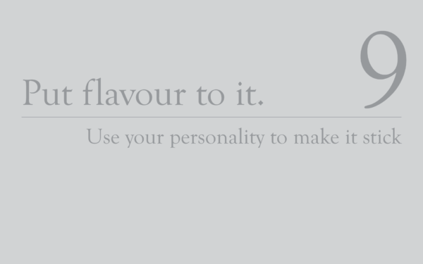
Put flavour into it.


9. Put flavour into it

As seen with Jody in the link above, a bit of personality shining through won’t hurt you. In fact, it’ll help you tremendously in getting your message across and being remembered. Don’t be afraid of letting your quirks show. You might feel vulnerable, but vulnerability is good. Remember – emotions win.

Obama had a lot of very well delivered, very serious speeches, but one of his most memorable ones has got to be his 2016 White House Correspondent’s Dinner speech where he lets his sense of humour shine big time. Flavour doesn’t have to be all goof and giggles though. Watch a few classes with Chris Do from The Futur and tell me you don’t think he’s genuine. It won’t happen. Chris has a great personality that he lets out fully in his classes and podcasts. It’s almost like you know him like a friend.

Practice.


10. Practice

And so we’ve reached the end of the list. Geez, there’s a lot to verbal comms! But don’t fret young Padawan, practice makes perfect. Have fun with it. Pick a rule and focus on it for a week, then try another one. This is a life skill. It takes a lifetime to perfect and you’ll benefit from it for an equally long time. Enjoy!

You can download these slides as a pdf here.

UX is the soul

You are UI. Can you guess what your soul is?

Over the weekend I met up with an old colleague and friend I haven’t seen for years. Another friend of his was also present and I learnt that he had done a UX bootcamp a few years back and was now working as a UI/UX design contractor.

When he described what he was doing in his current role I asked if he was mainly focusing on UI design, to which he replied

“I also do the UX.”

“What do you mean by UX?” I followed up.

“Oh you know, user journeys, on-boarding flows and such” was his reply.

I didn’t want to sound like I lectured him but I quickly gave him my view on why I think what he just described is UI design and why UX design shouldn’t exist. That was that, we changed subject and had a good night together.

But my brain wouldn’t let it go and later that night something presented itself to me. An idea around an analogy. UX and UI has been analogised many times, to anything from brain halves to cereal. If I could only find the perfect analogy, would that make it easier for me to argue my case?

The analogy that came to my mind was that of a person and their soul.

What is the soul anyway?

In spiritual thinking there is the concept of the soul. Some say the existence of the soul can be evidenced, some less spiritually minded people say it’s all bogus. Whether the soul exists or not is not relevant for this analogy, but it’s important to understand what we mean by soul.

The definition of soul that makes most sense to me is the one that states that we, humans, all have a spirit, a body and a soul. The body is our physical embodiment of who we are. The spirit is our unique person in this lifetime, that may linger in this plane of existence when we die but will eventually move on and reunite with other spirits. The soul is part of who we are in this lifetime, but essentially we are simply a host for it. A vessel chosen to be suitable to learn something. As long as the soul has lessons to learn it reincarnates – this is why some people claim that they have been somebody else in a past life.

Your identity is made up of your spirit and your soul, both with their own preferences and agendas. Sometimes conflicting. This is all obviously just theories but if it resonates with you then maybe the analogy between Spirit/Soul and UI/UX will also make sense.

You are UI. Your soul is UX

You are a physical, tangible person. You exist. You have an identity. You interact with the world. You are the UI.

Your soul is not physical. Not tangible. You can’t directly interact with your soul. It’s just this ‘thing’ that exists and supposedly has an enormous impact on your life but you don’t have any control over it. Your soul is the UX.

UX design was a mistake

Our industry made a mistake many years ago when it allowed UX design to become an established term. Never have I seen so much confusion around one term that has caused a lot of misunderstandings (and vague role descriptions).

I am now on a mission to try and correct that mistake by helping product teams use terminology that is easily understood. UI design does not equal visual design. UI design equals design of anything that the user interfaces with. A user journey is interface design. Of course it is. You are designing a string of touch points (interfaces) that the user will be exposed to and interact with.

For example:

  1. User calls up customer service
  2. It’s out of business hours so a recorded voice directs the user to go online
  3. User visits the company’s website and finds ‘My account’ link
  4. User logs into their online account
  5. User self-serves in the online account

Mapping this journey and working on it is UI design. 100%. A journey that steps across three touch points (phone, public website, logged in account). You might do this journey as part of a service design project, but this particular activity is UI design. It’s not UX design. Because there’s no need for it to be UX design when we already have a perfectly appropriate term for it: UI design.

You can’t design the UX although it exists. You can’t interact or communicate with your soul even if it exists. It’s a one-way street. UX designers aren’t doing UX design. We do research and UI design. Sometimes if we’re lucky we actually get to do strategy (lucky, because strategy affects UX more than anything else). UX can’t be broken down into activities in the design process, because UX is the result of the whole team’s effort. The whole company’s effort. UX takes place in the user’s mind and we can only hope it’s going to be a good one.

Do you have a counter argument and think UX design fits perfectly into your world? Do let me know.

Norwegian airlines, please invest in service design – A case study in failed customer service

Illustration of a missing suitcase in Norwegian's brand colours.

Let me bring you on a journey no one should have to experience.

It’s not pleasant but I hope it’ll be educational. Especially if you work at Norwegian airlines. In fact, I really do hope someone from Norwegian reads this and takes notice. If you are that person, please pass this on to your customer experience team, if there is one.

And if there’ isn’t one – I’d love to take you on as a client.

It all begins with a wedding

In July this year I flew back to Sweden from UK to attend my brother’s wedding. After the wedding in North of Sweden I went all the way down to the Southern tip of the country for a week of kitesurfing with my old university friends.

On my return to UK my checked-in bag, containing my kite gear, a wetsuit, various bits and bobs and the suit I wore at the wedding, joined 26 million other luggages that are lost each year by airlines.

You know the feeling if it’s ever happened to you. You’re waiting by the conveyor belt with everyone else, keeping a close lookout for your bag to arrive through the hole in the wall. One after the other, people pick up their bags and remove themselves. Until it’s only you left. You wait a bit more, starting to feel more and more anxious about the situation. Then the monitor says – All delivered. The conveyor belt stops. Reality kicks in. Your luggage didn’t arrive.

Luggage did not arrive

Could it be in the over-sized corner? Nope. Not there, and why should it? It’s a normal size duffel bag.

Ok, what do I do next?

A sign says lost luggage but the only manned counter is for British Airways. No sign of Norwegian at all, not even a sign with contact details as with EasyJet.

I check the Norwegian app for support. It reads:

You must let our airport representatives know straight away if your baggage doesn’t arrive on the same flight as you. You’ll be given a Property Irregularity Report (PIR) with a unique file reference.

Since no representatives are present in the luggage hall I exit to find them in the departures hall’s check-in area. But it’s Sunday around 10 PM and there’s no one around, so I leave the airport and go home.

Let’s just call customer service (if only it was that simple)

The following morning I call Norwegian. On their website there is no UK number available. I try the Norwegian one but it does’t work. I have to use Google to find a number to call.

The call routing has no option for lost luggage or general support. The automated phone service hangs up on me. I call up again and choose bookings. I’m forwarded to a human. She tells me that I need to talk to the airport.

(Note: The first five days of missing luggage the investigation is carried out by the handling agent of the destination airport. You learn a lot when CX is this bad and you’re left to deal with things yourself.)

I check Gatwick’s website to find a phone number. There is none. I find a page that says:

For missing baggage enquiries, please contact the handling agent of your airline.

I don’t know who that is. I call Norwegian again to find out. Thankfully, both times I speak to booking agents they are kind enough to assist me, although all they can do is inform me that they can’t help me. This time I get phone numbers to Gatwick and to Copenhagen airport.

Gatwick is fully automated and won’t let me talk to a human. They hang up on me.

I call Copenhagen and find a human. She is very supportive despite not really having anything to do with my lost luggage. She informs me of the name of Norwegian’s handling agent at Gatwick. They are called SkyBreak.

I go to their website and find a Whatsapp chat service. It connects but nothing happens. I leave it open and after about 30 minutes a person named David appears. He takes my case and returns with a link to an online form hosted by Norwegian, and a phone number to their baggage call centre.

The form is for damaged not lost luggage, and as I’ve already spoken with Norwegian and they’ve indirectly sent me to David I’m not satisfied with these two options. I ask David how I can get in touch with Norwegian’s handling agent, expecting him to say it’s them and I’m already in touch with them. Instead he disappears for a bit and comes back with a new player – Red Handling.

I’m given their email address and assume that by contacting them I will finally be able to file the Property Irregularity Report that should’ve been filed upon arrival in Gatwick. Finally the locating and retrieval of my lost luggage can start.

I feel like a Private Investigator – but we’re getting somewhere

I do email Red Handling but don’t hear back. After a day or so I look up their website and find a contact form that I use to send the same message as in the email. The following day I receive a response from Red Handling via email. If it’s a response to the email or the contact form I don’t know but I’m relieved that someone is finally getting back to me.

I’m asked to fill in a customs declaration form which allows Red Handling to create a Property Irregularity Report. Finally it’s logged and I receive a reference number which I can use to track the search progress on mybag.aero, the site I was given previously by David, but then for damaged luggage.

Or are we? Radio silence is all I’m getting

Then nothing for two weeks. After 21 days the luggage is officially declared lost and one can fill in a compensation form,  but this is not very tempting because:

  1. I have no idea how difficult it will be to get compensated.
  2. I’ve read that they are unlikely to compensate for the full value of your lost items unless you take it to court and win.
  3. Some things carry nostalgic value and will be missed dearly even if it’s not worth much.

I feel more and more nervous about time running out. Finally I message Norwegian via the mybag.aero site asking if I can have a status update. I don’t expect a response but the next day Mikael from customer service emails me and asks for a country code for my phone number. As I give it to him he responds that CPH and LGW airports have been requested to search their areas for my bag, and once found I will be contacted via sms or phone call.

I’m relieved to have heard from Norwegian and it gives me a glimpse of hope. Yet, one has to wonder if this was not supposed to happen much earlier in the process, and without me having to reach out for it.

I hear nothing the next few days and finally reach the 21 day limit, meaning I now should file a claim for compensation. This is done via an online form where I’m supposed to price each item and attach a receipt of purchase as evidence. This is a ridiculous procedure given that a lot of items might have been bought a long time ago or been gifted. Are we supposed to keep all receipts we receive until we die? Luckily I have a lot of the receipts left from online purchases in my email, but it doesn’t cover everything.

I submit my claim, receive a confirmation email and reply to it with photos from my trip showing some of my lost items. The story doesn’t end there but by now I’ve illustrated what an appalling customer experience one has to endure if you’re unlucky enough to lose your luggage with Norwegian.

Where did it go wrong?

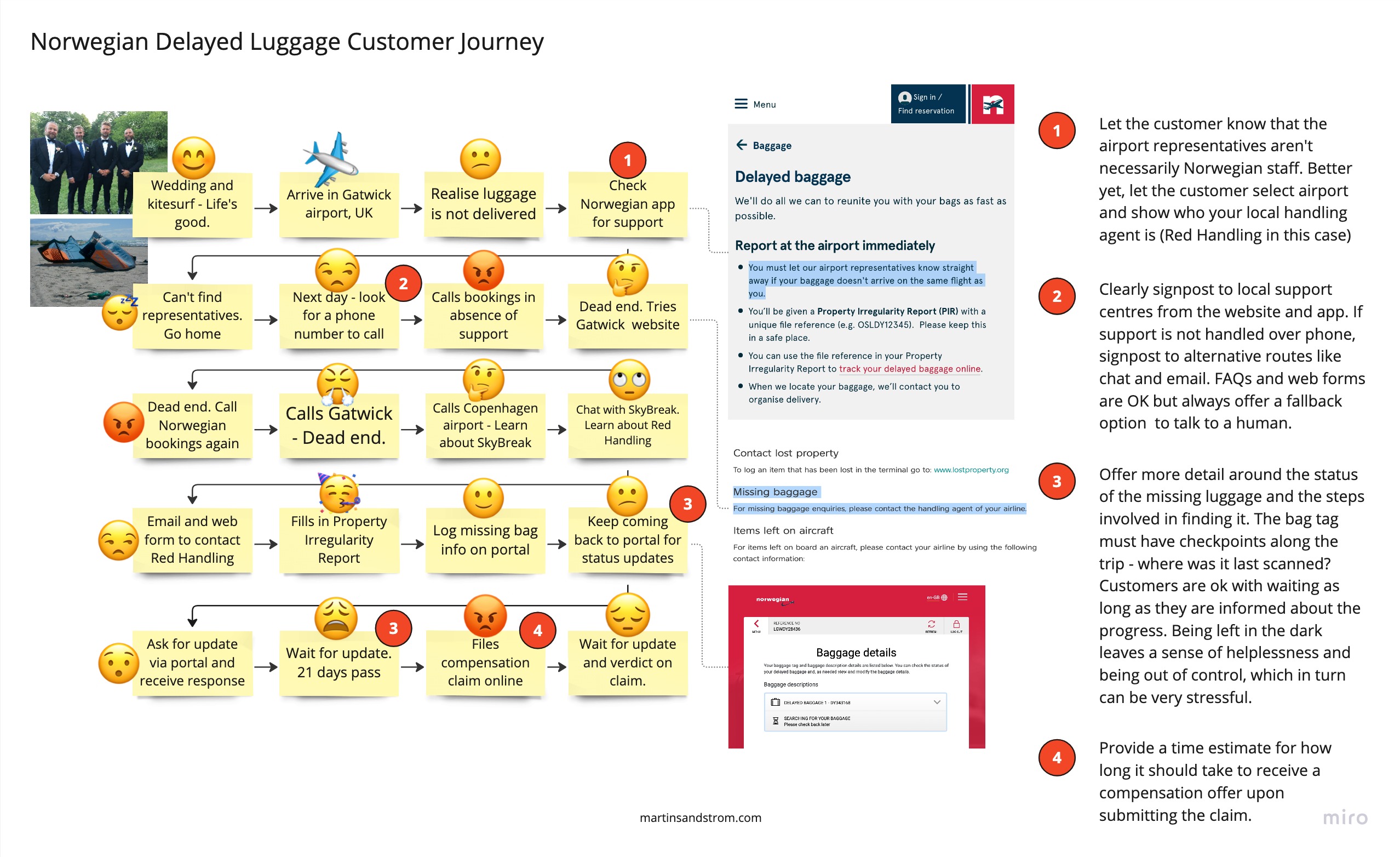
Let’s take a look at this customer journey map which illustrates the steps I described above and with some of the customer experience pitfalls highlighted.

Customer journey for delayed or lost luggage with Norwegian airlines. Presented with key moments where improvements can be made.

As one can see, we could’ve made a few changes to improve this journey early on. We can avoid the corporate hide and seek, stress and damage to the brand if Norwegian would have applied a holistic service design approach.

Only by conducting customer research and mapping end-to-end journeys can we detect these problems and make sure that experiences aren’t isolated in silos, but rather work in an orchestrated union that results in a great customer experience.

It should be said though that it’s easy to blame Norwegian since they are the service provider on surface level. But as we’ve come to learn, there are many operators involved who all need to collaborate and understand the systemic consequences of acting in their respective part of the system.

It turns out it wasn’t Norwegian who lost my bag. Nor was it Red Handling in Gatwick. Rather they should’ve been excluded soon in the process to turn our attention towards Copenhagen. It’s possible that it was my fault even and I hadn’t attached the bag tag properly (it was one of those self-service check-in and bag drops). Mistakes do occur, and rather than casting blame it’s important that we focus on finding the root cause, the CX pitfalls along the unhappy path and come up with solutions for both.

Did they ever find my bag?

In short I keep chasing Norwegian for compensation and progress updates for another five weeks without getting any response, until one day I make a phone call to customer service. A lady picks up, asks for a few details about my bag that I’ve already left in the original report – and somehow magically finds my bag at the departure airport in Copenhagen.

Apparently the ID tag had come off after checking it in and it never got further, nor could it be identified until the customer service did her magic. It’s concerning however that it took this long and only upon me calling, without actually providing any new information to identify the bag. Which makes me think that:

  1. They could’ve identified the bag a long time ago but somehow the case fell between the cracks.
  2. I would’ve never seen my bag again if I hadn’t chased it up myself.

I did get my bag back. The wetsuit was rank after two months and needed a thorough wash but part from that it was all fine. No apology from Norwegian however. Unfortunately there are few things we can do as consumers other than rant and moan but at least I’ve learned my lesson and will keep my contact details clearly on display in my luggage from now on.

My transition from product design to service design

systems thinking and service design model by Martin Sandstrom.


2022 was the year when I realised that I cannot succeed in my current role at Legal & General unless I adopted the mind and skillset of a service designer.

This was not an epiphany. I didn’t wake up one morning and thought ‘I need more service design in my life!’. I’ve been working with digital products and services since 2007 and my career path has followed a typical trajectory of starting hands-on, learning the ropes and adding enough experience to start seeing the mechanics of the system. And once I started to ‘get it’ all of a sudden it became less and less interesting to work with surface level UI challenges.

More and more, system design was what really interested me. Business models, value propositions, designOps and service design. So one can say that the interest for system thinking and service mapping had existed for a while. Although I had practised service design here and there in my roles as a product designer I had not yet been in a role as a service designer.

And there is an important difference.

Doing service design and being a service designer is not the same thing. I had to learn this the hard way.

From UX to EX

When I joined Legal & General in 2021 it was to fill the role of senior experience designer. I assumed the work would be things like requirements gathering, user research, product design and testing for our customer facing self-serve portals etc. The typical UX stuff.

But after I joined I was immediately given the sole responsibility to work on our internal systems, services and products. This was a new area given to the division and important enough to dedicate a full time designer on it. What ‘it’ referred to was less clear. Slightly outside the comfort zone for a contractor like myself who’d normally request or co-create a very clear brief and statement of work before any work will commence.

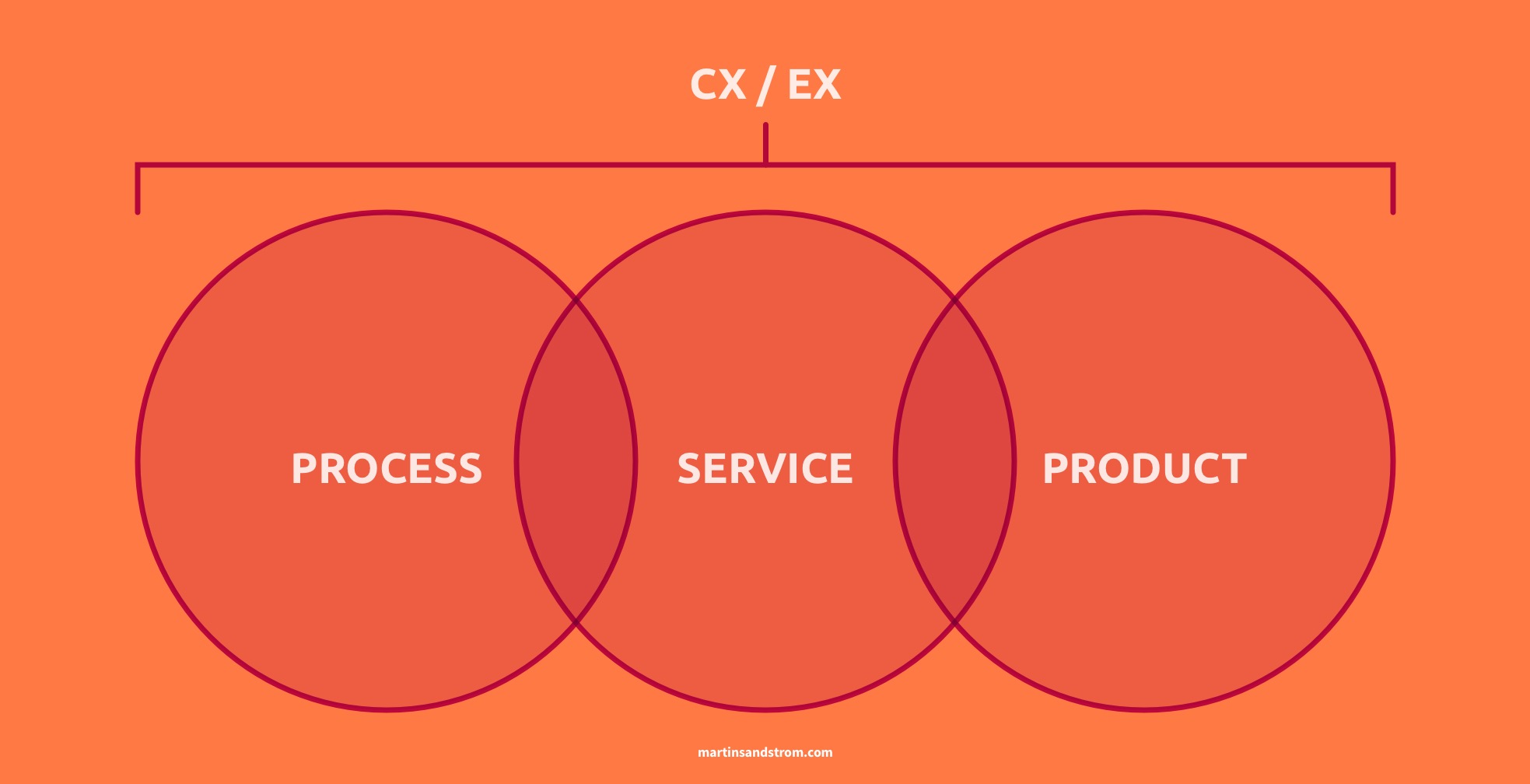
Turns out ‘it’ had something to do with the fairly recently coined term Employee Experience (EX), which was the natural progression after employee engagement. The HR community had realised that employees could benefit from a more holistic approach, similar to the one applied in Customer Experience (CX).

So off I went, farther and farther away from my comfort zone, looking to create my own brief whilst reaching out to people who had titles sounding like they had something to do with EX. All remotely, of course since we were in the midst of the pandemic.

Writing your own brief when you don’t have a budget, remit or even a name and reputation that means anything to anyone, is a bad idea. You won’t get anything done. I did a bit of user guides, intranet pages, EX research and principles work, tried to get some traction in an EX strategy and collaboration between departments, but in the end it was a pretty weak existence. It was not something I was used to but indeed a sober wake-up call.

Product design has a very limited area to operate in in the world of EX where the organisation doesn’t own any of their employee facing products. And this is where my mindset shifted to service design.

What’s the difference between product and service design?

Think about it this way; screen design is very much a tangible thing. The information architecture, user flows and content strategy are less tangible but still pretty easy to understand with good visualisation tools. All of this is backed up by user research and the goals that are defined for the product. That’s product design in a nutshell, right? Who delivers these things? The product design team normally (read my take on the design dream team here).

Now let’s take a look at a service: Onboarding a new employee when they join a company. How do you design this service? Immediately we realise that a service design team can’t be the ones delivering this, because the service has a lot of interdependencies between teams and divisions such as HR, Finance, IT fulfilment, IT support, Security, Employer brand and Legal. All of these teams might no be hands-on when the employee joins but they will have been involved at some point on process or policy level.

This is why service design is intrinsically co-creative. Although a service design team might be responsible for delivering the blueprint, or solution, it never happens without the involvement of the teams that the solution will feed back into. A product team will no doubt involve other teams in the creation of the product, but in the end they will be the owner of the solution. That’s not the case in service design. The solution is co-owned by many teams and everyone needs to be onboard.

Despite the title, service designers don’t do design. We don’t own design decisions and we don’t do design in the traditional sense that many of us are used to from previous roles.

A service designer’s job is to facilitate the orchestration of systems to produce human-centred, positive change.

We’ll get back to that definition in a bit.

Why is service design so difficult?

Compared to service design, product design is easy. There is certainly an overlap and no digital products live in a service-less vacuum. There’s a service behind every product. But the part of product design that isn’t bothered about the service processes that support it is comparatively easy.

Why?

Because a product team is (at best) a self-sufficient task force on a mission to deliver, and everyone is working towards the same goal. Introduce more teams, more policies, more agendas and your road bike just got swapped for a tricycle. Because things get exponentially harder the more people involved. People make things messy and complexity rises.

As a service designer you’ll be introducing teams to new ways of working, encouraging them to collaborate for the benefit of the user and slowly nudging the system towards a new state. Unless you have a senior management sponsor to push things along with sticks and carrots it can sometimes feel like an impossible task.

When teams don’t show up to workshops, critical decisions get put on indefinite hold and every step you explore in your process map opens up three new ones, owned by teams you’ve never heard of, it’s very easy to settle for some ‘quick wins’ on UI level that you can actually control. Erika Flowers puts it beautifully in her modern classic on Medium. I can relate to every point she makes, and sadly say that it’s still very true in 2023.

What skill set do you need to dial up when you transition into service design?

If you’re not put off yet and you’re still up for the challenge, here are some tips on what to focus on from my own experience. Here’s my definition of the service designer role again:

A service designer’s job is to facilitate the orchestration of systems to produce human-centred, positive change.

Let’s dissect that definition to better understand what’s asked of us when we step into a service designer role.

To facilitate:
Make (an action or process) easy or easier.

The secret sauce that service designers often bring to a project is to be the glue/catalyst/mediator between different stakeholders. We see this all the time. Everyone is busy in their own part of the world and along comes a change initiative that forces different teams to either start talking to each other or feel the pain later. Sometimes there isn’t even a change initiative from above and you have to work laterally in the organisation without any sponsorship. That’s really when these skills become a life saver.

As a facilitator you help those conversations along, by building rapport with teams, running workshops, agreeing accountability and setting up transparent communication channels. Workshop skills are hugely beneficial here, but also the importance of soft skills like patience, empathy and confidence cannot be emphasised enough.

Orchestration of systems:
The planning or coordination of the elements of a system to produce a desired effect.

This is where the plan of action is shaped. It happens mainly with visualisation tools like process maps, user journey maps, service blueprints and prototypes. Learn them, feel confident in using them and don’t get too bogged down in design methodologies and theory. Early on I spent a lot of time trying to figure out if I should use a process flow or a journey map. A blueprint or a system map. But it really doesn’t matter. They’re just slight variations of the same thing with different names, i.e. a model of a system that will help you and your stakeholders align and focus on the right thing, in order to know what to do next.

These maps are not deliverables, they’re just tools. They should evolve over time so don’t spend too much time perfecting them. You can wing it. Start small and add to it as you learn more. My maps are Frankensteins created from all sorts of diagram theory. But they get the job done.

Mapping exercises takes place in many different settings. You can map on your own, you can co-create with end-users by showing them a draft and let them tweak. You will co-create to-be and as-is maps in workshops with your stakeholders, and you might sit down with a subject matter expert and iron out parts of a map in a 1-2-1.

To get to grips with the all the bewildering theory my first port of call would be the bible-like status, go-to resource for all service designers; This is service design doing. From there the list of literature is endless, but that’s for another post.

Human-centred:
Computers, technology, systems, etc. that are designed to work in ways that people can easily understand and learn.

If facilitation is the secret sauce we bring to change projects, human-centred thinking is what separates us from business analysts and solution architects. The skills needed here, part from the mindset you probably already possess, lie within user research. Human-centred design without user research doesn’t exist. Even if you simply do best-practise usability and accessibility you’re still applying someone’s recommendations that were derived from research.

If you don’t have a researcher on the team you’re likely the one specifying the research goals, creating the plan, collecting the data and synthesising the results. So it’s very useful to pick up skills in user research from a professional source. There are many pitfalls.

Positive change:
Changing something for the better.

Not as much a skill as it is a virtue, but a moral compass will help shaping you long term. In service design you often get to work on larger change projects than in product design, and they can have a large impact on people, animals and environment. Considering the big picture is a cornerstone of systems thinking, and we need to remember that doing the right thing for one part of the system could have a negative effect somewhere else.

For a completely hypothetical example, changing from fossil fuel to green energy is great to combat pollution, but if the solution is more off-shore wind farms that affect the marine life in a negative way we have to think again. Stay true to your moral compass and often switch lens to zoom in and out to better understand the intricacies of the system and how it will respond to change.

To conclude

You can definitely make the transition into service design from product design, just be prepared for what’s to come. It’s slow, it’s messy, it’s political. But it can also be very rewarding. I’m just at the beginning of my transition and we’ll have to wait and see if I’m just here to dabble and then return to product, or if it catches on and I make a full transition. Either way, what I’ve experienced so far has taught me a lot and forced me to grow so I encourage anyone who’s interested to go for it. Be patient, and be kind to yourself and your stakeholders along the way.

artwork

Digital Product Dream Team – The Optimal Team Structure in Software Development

What does your product team look like?

Would you change anything if you could?

As part of agencies and in-house teams I’ve seen many different takes on product org design. Things got done one way or the other, but the teams were often far from optimised and it wasn’t always without friction. I saw a lot of overlap in skill-set, and role descriptions that narrowed down people’s responsibilities to a sub-set of their true potential.

It’ll become apparent that this article is written by a former UX designer (former not because I’m retired but because I refuse to use that title any more). Too often it’s a role being shoehorned between other roles when it shouldn’t be there in the first place.

To figure out what skills we can shuffle around and get a more optimised team we first need to look at our building blocks.

The typical roles involved in digital product design

Let me list some typical pre-development product team roles and what they are often expected to be in charge of.

Delivery / Project manager

  • Plan activities and timings
  • Coordinate and scope team effort
  • Manage client and stakeholder expectations
  • No issues here, they usually let us get on with work

Product owner

  • Product strategy and roadmap
  • Manage 3rd party relationships
  • Track performance
  • Final say and sign off

Design strategist / Business designer

  • Typically an agency role overlapping product owner, user researcher and UX designer
  • Functional and business requirements
  • Product strategy
  • Content strategy
  • Research

UX designer

  • User research and testing
  • Functional requirements
  • Journey mapping
  • Information architecture
  • Content strategy

UI designer

  • UI and visual brand exploration
  • Design system management
  • Visual & Interaction requirements
  • Production design

Business analyst

  • Functional requirements
  • User stories and sprint preparation
  • Acceptance criteria

Usually backed up by:

  • Head of design / Creative director
  • User researcher
  • Copy writer
  • Quality Assurance tester

And to make the list complete I’ll also include the dev roles I’d normally work alongside:

  • Front-end developer
  • Back-end developer
  • Systems architect
  • DevOps engineer

You wouldn’t normally see a team with all of the above roles. Some are more common in-house and some are more agency related. It’s also not uncommon that one person straddles multiple roles. I’ve had product owners also acting as delivery managers, QA being dealt with by the dev team and UX designers doing BA tasks.

None of these roles are superfluous when combined correctly. They all possess unique skills that can be utilised with minimal overlap in an optimised team structure.

The question is; what is that structure? I think the answer is in the design process:

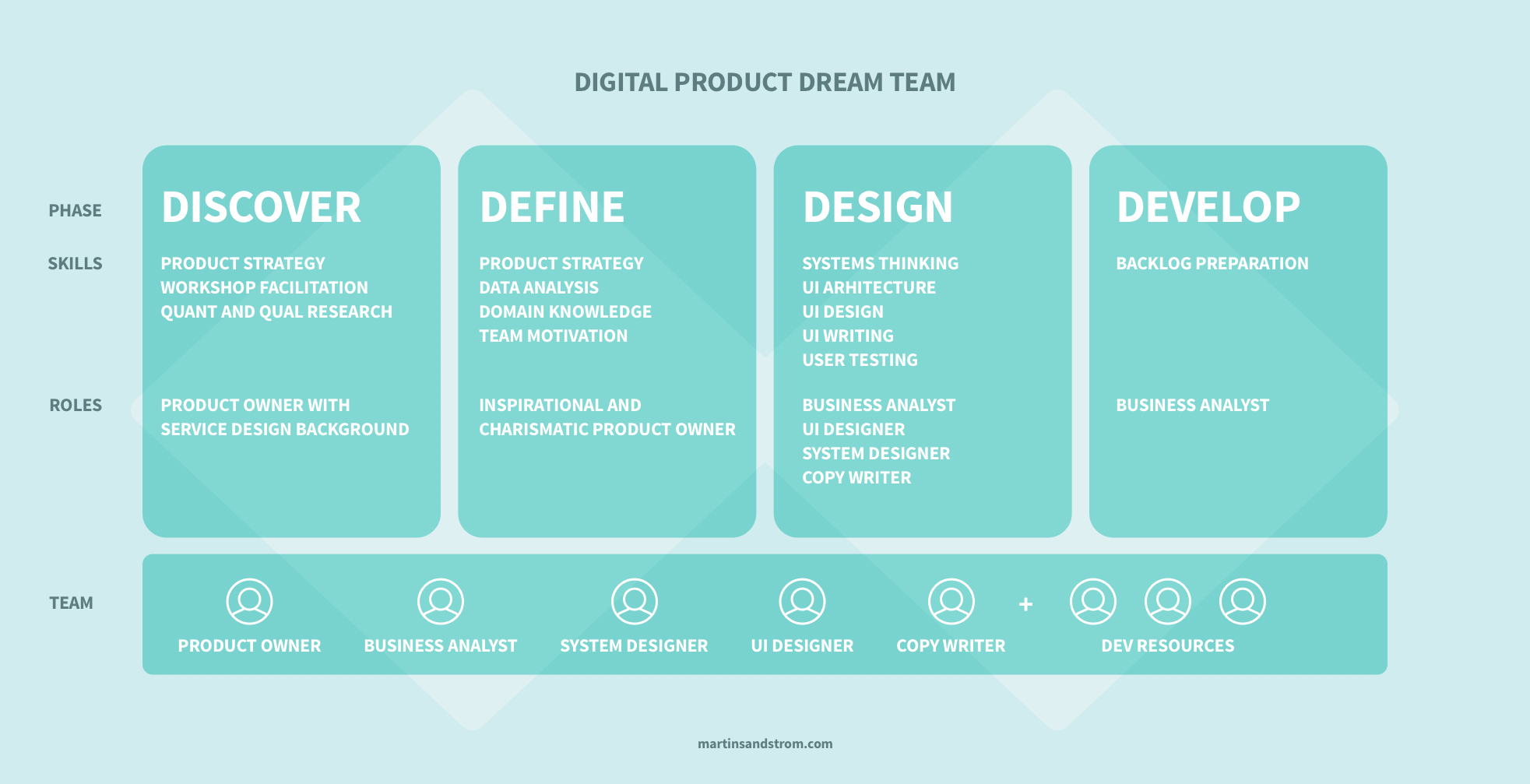
Discover, Define, Design, Develop.

Four distinct phases to product development, each of which requires unique skills. Let’s examine them and see what those skills are and what roles they might translate to.

Skills required for each step in the design process

Diagram showing the ideal digital product team structure and roles.

Discover

This phase is characterised by problem/opportunity definition, business requirements gathering and market and user research. Skills you want here are product strategy, workshop facilitation, quant and qual research. The define phase could be a joint responsibility of a product owner and a researcher, or it could be handled by someone possessing both skill-sets.

We haven’t talked about the service design role up to this point, as it’s less to do with product development and more with organisational change. But if we look at the service designer’s toolbox we find all of the above mentioned skills.

Having said that, the product owner is essential to any product team and for that reason I’m inclined to say that a product owner with service design background would be my go-to candidate for the Discover phase. If it’s a large project and there’s budget for it they should probably take use of an external research agency, because research, as we know, is a time-consuming activity.

Define

Define is a proportionally short phase in the process. I considered merging it with the Discover phase, but in doing so I would’ve missed out on a crucial step. Once the discovery phase come to an end and presents its synthesised body of work, it’s the job of a strategist to decide how to proceed to achieve a desired outcome.

In one company I worked for, the discovery phase had presented a market opportunity to build a product that brought all household bills into a consolidated view. In this case the product owner was the one picking the way to market, deciding that we’d initially focus on the flat sharer segment, and due to the nature of the service would serve them via a mobile app. He could’ve chosen 100 other routes to market but this was his product strategy.

The point I’m making with the above example is that Define is extremely important since it will shape all the work thereafter. For that reason I’m choosing to break it out from Discover. What you need here is an experienced and visionary person who can spot market trends, use data to form an opinion but also trust their gut feeling. Finally they need to be able to communicate the strategy and inspire the team. This is not a small feat and it must land on the product owner’s list of responsibilities.

Design

Once the product strategy has been decided we enter the Design phase, which includes design exploration, concepting, information architecture, technical feasibility, design system development and screen design. Some of these tasks might happen pre-development while others happens alongside development in an agile manner.

We need skills like IA and systems thinking, visual UI design, interaction design and possibly animation, UX writing (i.e. UI focused copy writing), prototyping and usability testing. There’s a lot to cover in the design phase, and that’s why it has traditionally been broken into UX (function) and UI (form). However, if you have come across my writing before you know I’m not a fan of this separation and I much rather hire “full stack” product designers capable of doing all of this. I’d also get copy writers who can span everything from marketing to UI copy.

In reality it’s hard to find designers who can do it all, and you should consider a split between UI designers (or product designers if you like) and system designers. The UI designers do the product architecture and design from concept to screen layouts and testing. The system designers own the design system, including interaction design, visual styling and accessibility guardrails.

This means that for screen designs there will be close collaboration, but in an ideal world the UI designer can build the pages with existing components, and when components are missing they can request them to be added to the design system backlog.

Develop

In terms of development I’d be stepping out of my remits to say what the ideal team structure is. I normally work closely with developers, solution / system architects and business analysts and what stands out to me here is the business analyst (BA). As a UX designer I’ve always had a large overlap in duties. If there’s one in place I can be a lot less rigid in my documentation and trust that all requirements will be neatly added to the sprint backlog. If there isn’t one in place I have always made sure that the visual and functional UI requirements have been fully documented in a consistent format.

Can we afford the luxury of a BA on the team, or should we let the UI designer document their designs as user stories including acceptance criteria? This is an elaborate task, so for now I’ll keep a BA on the team and include them in the design phase by taking the product owner’s direction and translating it into product requirements and design briefs for the UI designers.

This way the BA becomes the interface between designers and the rest of the team. This doesn’t mean that design happens in a black box where designers never discuss with developers or business, but it can be a great relief to be able to fully focus on design and should in theory remove friction for the team.

What about designer/developers?

I was also considering bridging the gap between design and code by using front-end developers who are skilled in UI design (and basically exclude UI designers from the team). But skilled is not enough – most front-end devs know how to apply UI design theory. The developers I work with take a real interest in the usability and usefulness of the end product. But what they really care about is writing great code. Most developers that care enough about design to be great designers eventually jump the fence and become designers full time. The days of the web-designer is over, and the few that can generate both great design and great code are not called unicorns without a reason.

Summary

Looking at my dream team I realise I have made myself more or less redundant. But I guess I knew that was coming. My title was UX designer for a long time, and I don’t think UX designers should exist. If this was indeed my team I reckon I could either lean on my service design knowledge and be the product owner, or I could be the UI designer.

I’m keen to hear your thoughts on this theoretical team structure. Would it work in reality? Would you fit in? What does your dream team look like?

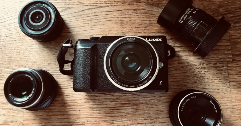
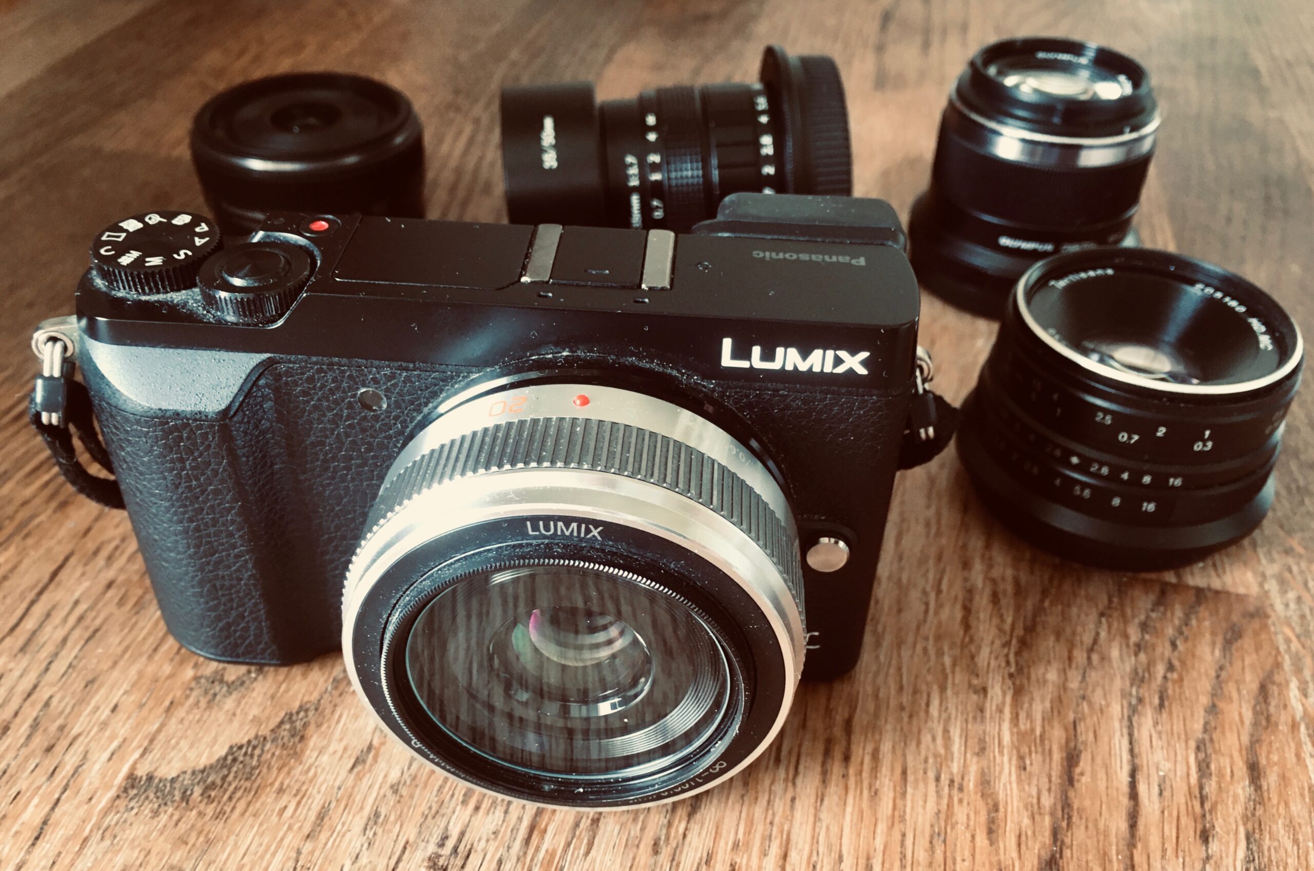
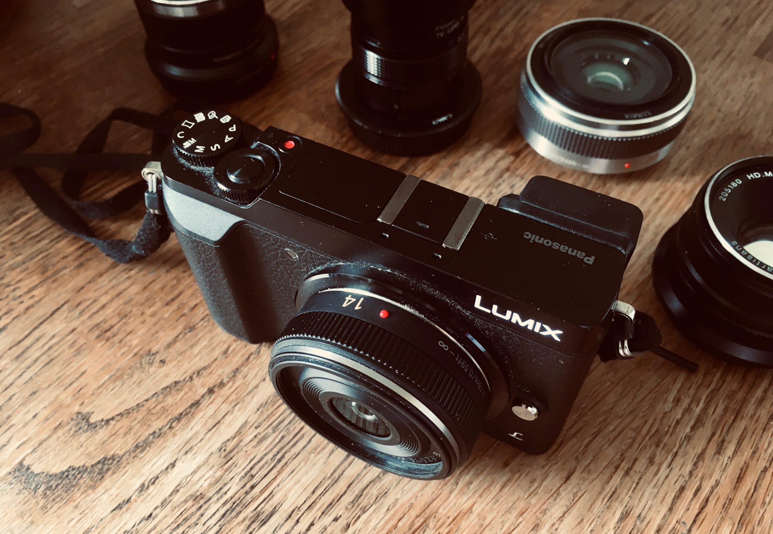
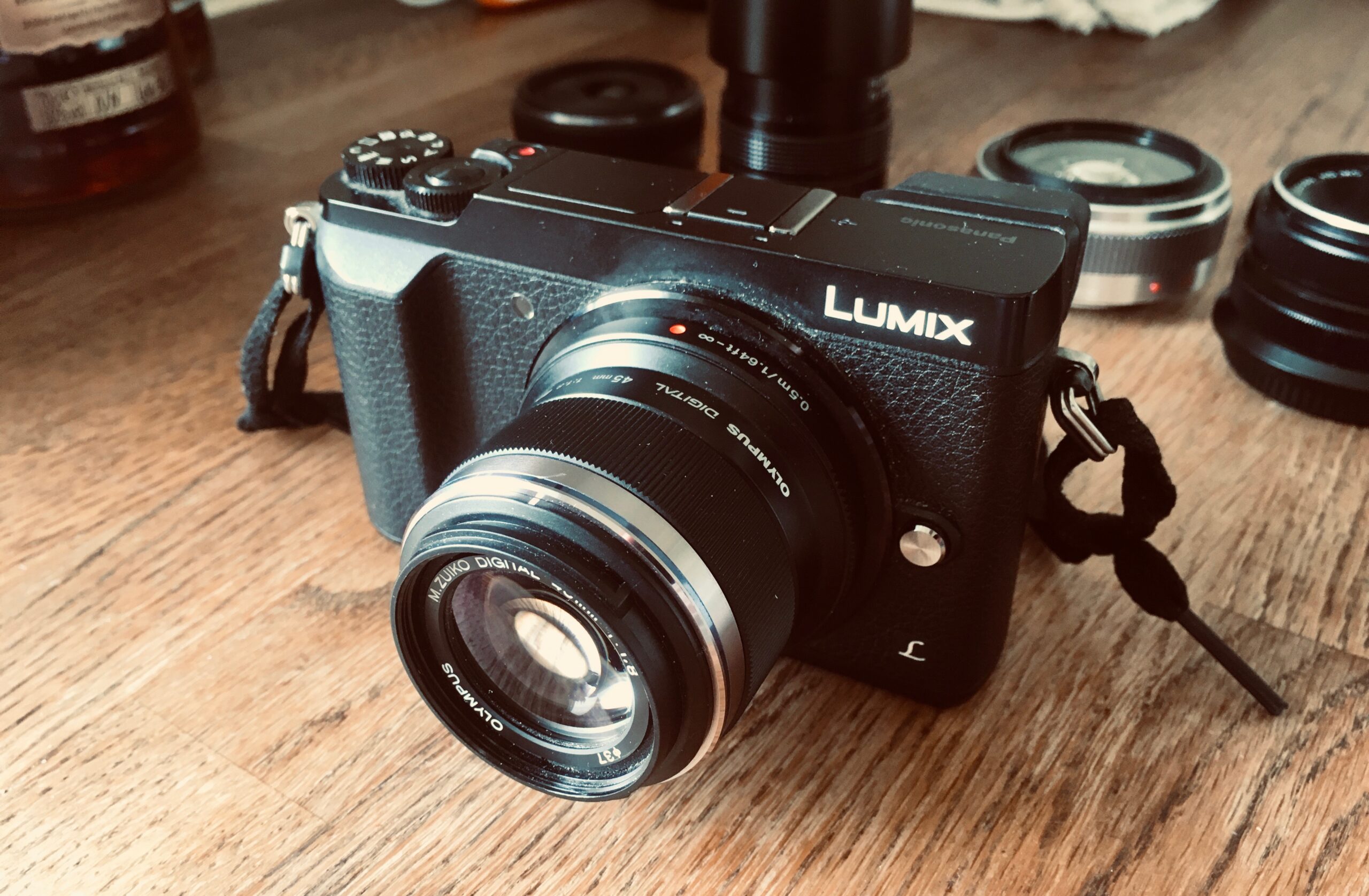
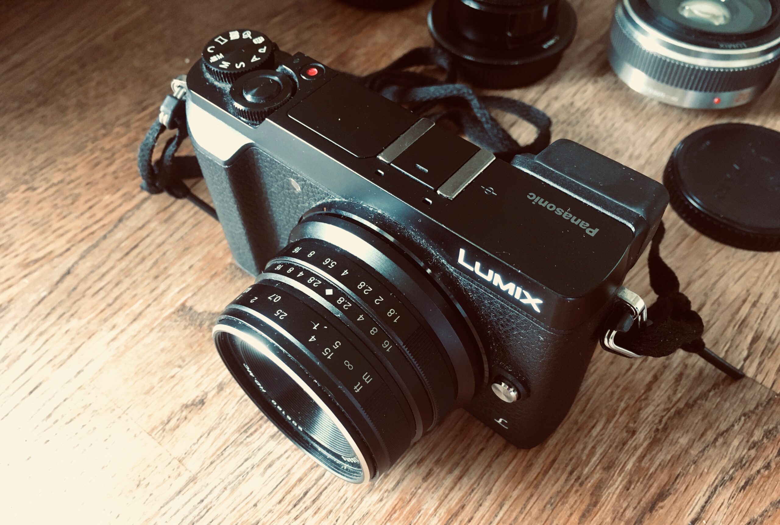
Lumix GX80 and M43 prime lenses

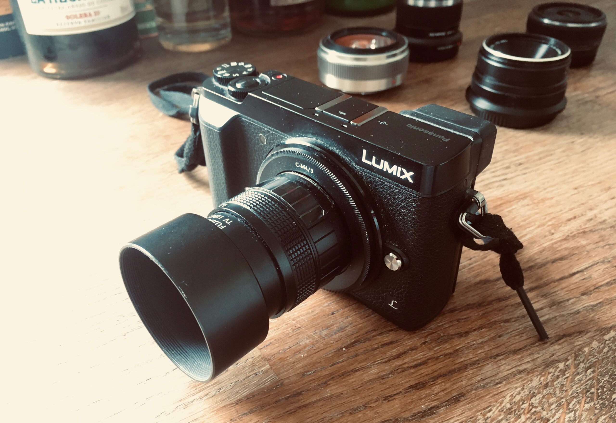
My M43 Camera setup – Lumix GX80 with prime lenses for Micro Four Thirds system

My camera is Lumix GX80.

It was released in 2016 and in 2019 when I bought it, it was a bargain. I bought it because I wanted to improve the image quality of globalkitespots.com, but also because an interest in photography in general had started to grow in me.

I’m the kind of person who does hours and hours of research before I buy something. The world of digital cameras is probably one of the most opinionated and documented gadget driven hobbies there is, so there was definitely no shortage of material to immerse myself in.

I wanted a system camera for the versatility of changeable lenses, that much I knew. I also fairly quickly narrowed it down to a mirrorless APS-C or Micro Four Thirds camera for the small form factor (essential for documenting my kitesurf trips while traveling light).

After a number of hours I’m too ashamed to fully disclose I had finally landed on the GX80 by Panasonic. It just felt right, despite not having tried any of the models I’d considered. For me, the value offered with the GX80 couldn’t be beaten. The smaller size and cheaper price tag of the M43 lenses compared to APS-C was the winning factor. Although Olympus has some attractive models like the PEN-F, it was the cheaper price and my positive experience with Lumix cameras in the past that sealed the deal.

What alternatives to Lumix GX80 have I considered?

After two years of shooting with the GX80 I’ve learnt a few things of how I shoot, what’s important to me as a photographer and what I want from my camera.

From the GX80 there are two possible routes I’ve considered. One is to opt for even more portability and go for the tiny Lumix GM1. The advantage would be that I already have compatible lenses, and the reduction in size and weight. But it would still not be pocketable with a lens mounted, so that advantage is only minor.

The battery wouldn’t last as long as the GX80, but the biggest downside was something I only discovered after using my GX80 for some time. I don’t use the viewfinder much and I could live without it, but what I love with the GX80 is the tilt screen that lets me shoot with accuracy from the hip. The hip angle has totally become my thing for street photography and I would hate to loose it.

The other way I could go is up. Up in sensor and lens size. Since I picked up photography I’ve always had a soft spot for Fujifilm’s X-E series. It’s basically the equivalent to Lumix’s GX series but a bit more purist. Unfortunately the earlier versions don’t have the flip screen, and the latest X-E4 is simply too pricey at the moment. On top of a pricey camera body I’d also have to invest in new and costly lenses. Why would I do that? Simply because the larger APS-C sensor would offer shallower depth of field for the same view angle – and who doesn’t love shallow DoF? If there’s one thing that makes the photography community drool it’s BOKEH!!! 🤤🤤🤤 Hey, count me in 🤷‍♂️

Sony’s 5000 and 6000 series also look like they’d serve my needs well. They’re compact, got tilt screens and raving reviews. I might give Sony or Fujifilm a go at some point in the future, but for now I’m happy with my current set-up.

Now, let’s take a look at the lenses I use.

Prime lenses for M43

I only shoot prime. Not because I’m a camera snob, but for one it’s a smaller form factor, and two they are generally faster i.e. lower aperture. And what does low aperture give me? More BOKEH!!! 🤤🤤🤤

It’s no joke. With the smaller M43 sensor I have to make my lenses work hard to achieve shallow depth of field, and most photos I take benefit from separating the subject from the foreground and background. I love layered photos and often add depth by including an object at the very front of the image.

Hunting for prime lenses to add to my collection was great fun in the last two years. There could still be some old telephoto lenses I might want to get in the future, but for now I’ve got five lenses to cover most of my needs. With a bit of patience I got each of them for £100 or less on ebay, and that’s the beauty of M43. What other system can give you that!?

Lumix 20mm f/1.7 II

This compact pancake wonder is my everyday shooter. It’s the perfect compromise between view angle (40mm equivalent), DoF and size. This lens is my go-to for street and indoor photography. The auto focus allows me to capture things in the moment.

Lumix 20mm f/1.7 II on GX80

Lumix 14mm f/2.5

This extremely compact lens is great for when I need a bit more wide-angle. Dinner parties, kite beaches with subjects in the foreground and layered landscapes. This is also my lens for shooting travel documentaries on the GX80, although I prefer GoPro style action cameras for that. It’s nice to have, but it’s my least used lens since it’s the same focal length as my iPhone and doesn’t offer that much more in terms of image quality.

Olympus M.Zuiko 45mm f/1.8

The Olympus 45mm is a 90mm full frame equivalent portrait lens. I don’t shoot much portraits but rather use this for anything from product to landscape and street. I love the long focus and shallow depth of field that really put emphasis on the subject. Telephoto is great for capturing people a bit more candidly from a distance. It also helps for landscape with a subject far away. The lens is also auto focus which makes it versatile.

7Artisan 25mm f/1.8

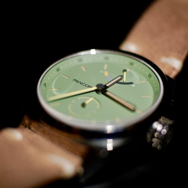
This was my first lens for the GX80. The 50mm equivalent focal point and manual handling took me a while to get used to, but it was great fun to start like this since it made the shooting more analogue and craft-like. Once I had my auto focus lenses I used the 7Artisan way less for people photography. I’ve kept it only for one reason really, but a good one. Watch photography. I found that it’s by far the best lens I have for watch photography thanks to it’s short focus. And I do watch photography a fair bit. Sometimes I use it for other types of product photography and mood-infused stills because the bokeh is really nice and creamy.

7Artisan 25mm f/1.8 on GX80

Fujian 35mm f/1.7

Finally this guy. I call this my arty lens. It’s a CCTV lens that you can pick up for £25, but the quality is really rather decent and the way everything except the subject is out of focus is quite a nice effect for some type of photos. I use this for street every now and then, and because it comes with extra focal length adjusters I’ve taken some great macro watch images with it as well.

What’s next?

Because of the affordability of M4/3 lenses I’m constantly on the hunt for interesting lenses to add to my lineup. For what I do, I don’t think I need to add much to what I already have, but out of curiosity I keep looking for funky little manual lenses converted for M4/3.

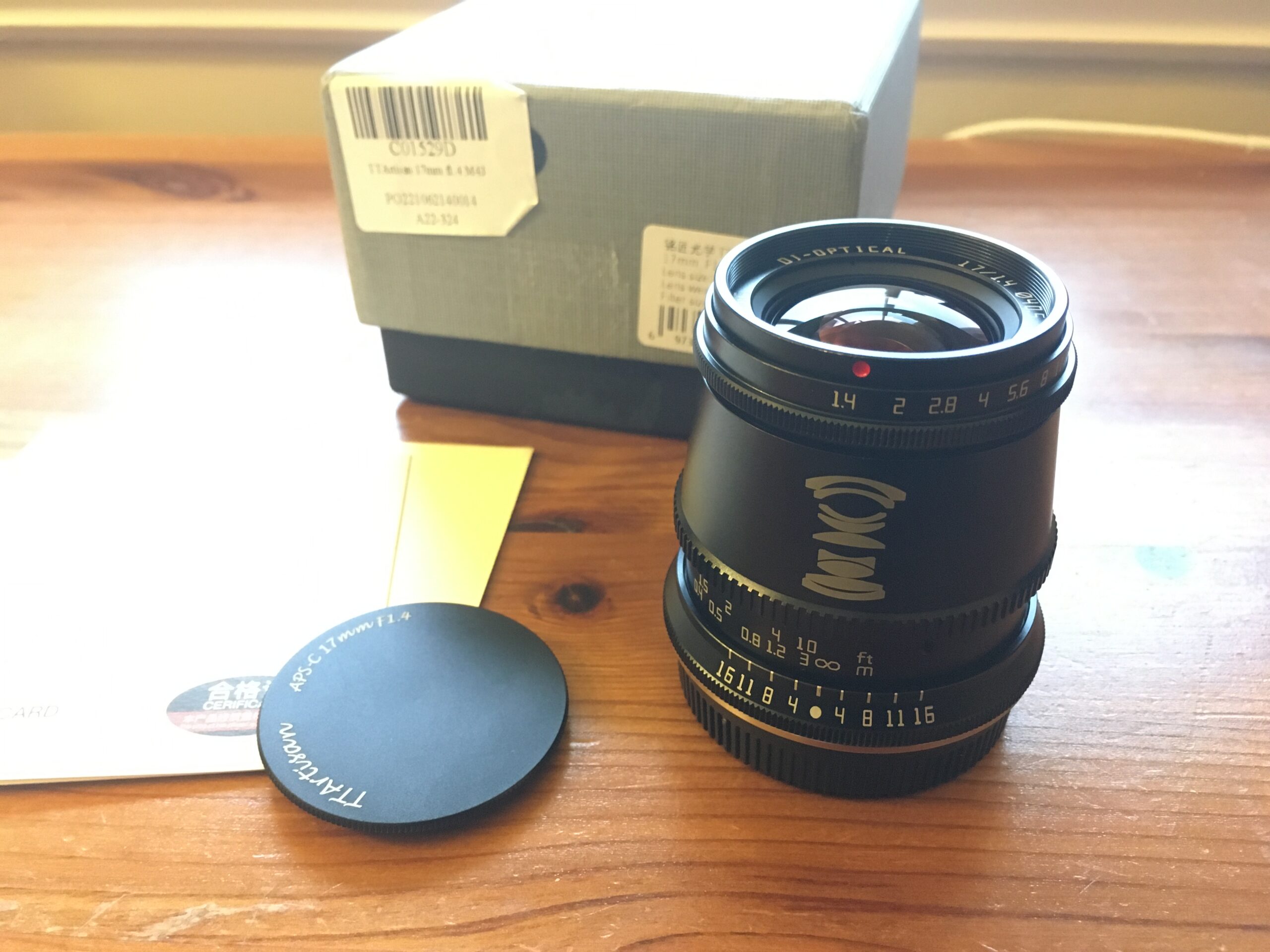
I recently tried the latest lens from TTartisan, a Chinese company focusing on affordable manual lenses. They have a lens that sounds amazing on paper: 17mm 1.4. Basically a bit more wide-angle than my 20mm Lumix, but with shallower depth of field. It sounded like a great street lens.

The TTartisan wasn’t for me.

It wasn’t bad, but I quickly realised how amazing the 20mm lens is after spending a weekend with the TTartisan. It’s heavier and larger than my other lenses, but didn’t offer anything my 20mm can’t do. So off on ebay it went. But I’m glad I tried it, and I’ll keep trying more lenses in the future. Especially for street, it’s like rediscovering your city with new eyes – and who doesn’t like that?

Abstract illustration of business purpose

What’s the purpose of a business? To create value or profit?

The sole purpose of a business is to sustainably deliver value.

The sustainability part is important here because this is how the business stays afloat. It’s the enabler of the value delivery. It’s done by receiving something in return for the value delivered.

In practise, it’s being profitable. Making money.

I used to think that the purpose of a business was to make money, period. But of course, all great companies have a vision and that vision is never about making money – that’s just a result of being successful while working towards the vision.

So, is the company purpose to act on its vision?

The vision is about value. In the end we all want to make the world better in one way or the other. Many will succumb to greed, but I wholeheartedly believe that even the greediest person in the world still has a moral compass that tells them what the right thing to do is. They may not act on it, but if they could find a win-win to get rich while improving the lives of others, they would prefer this option.

In literature we read a lot about the value part of the business purpose. In theory it makes sense to start with Why, to be Driven by purpose, to join the Purpose Revolution, to be a Vision Driven Leader

But too often when you’re waist deep into a project, the vision has seemingly vanished from people’s minds and the focus is on reaching the financial targets for the quarter, incentivised by a tantalising year-end bonus.

Vision is good, but money talks.

In theory it’s all about the vision. In practise, I find, it’s all about making money. So over the years, because I’m a no-BS person, I adopted the pragmatic money-making approach.

We’re a business, not a charity, I used to think. But I knew that couldn’t be the whole story. Too many books said otherwise. Books I agreed with in theory. Living like the Wolf of Wall street might be awesome for a while, but it’s not sustainable long-term (literally, but also for company growth).


The coexistence approach – one leg in profit, one leg in value

When I joined Legal & General, I learned about their vision – Inclusive capitalism. This resonated with me, because for the first time I saw a vision that combined value and profit. As a financial institution mainly focused on capital investment you have to include profitability in your vision if you want to keep a straight face. But equally important in the vision of Inclusive Capitalism is HOW you invest. Investing in profitable projects that bring value to people and improve lives is the purest form of delivering value in a sustainable way. The company IS the enabler of value delivery.

So thank you, L&G, for helping me come to terms with my profit-driven self. It’s never about profit or value alone. They need to co-exist. It is a simple idea, but it needed to be articulated to sink in.

Light sipping into a dark room from an open door.

Want to become a UX contractor? Get comfortable with uncertainty

Working as a contractor in digital product design is amazing. You’ll get to be in control of your work arrangements while charging rates usually a fair bit higher than permanent employment offers. These high rates compensate for unpaid annual leave and lack of pension schemes, and cover running costs such as insurance and accounting.

But if the steady routine of a regular 9-5 job year after year doesn’t suit your lifestyle, and you’ve got a bit of financial acumen, my experience tells me that being a contractor offers you both freedom and good finances. On top of that you’ll need to keep pushing yourself to stay relevant, and in return you’ll get to work with new clients, expand your professional network and constantly learn new things.

The most common reason against contracting and freelancing is the financial uncertainty. Having a bit of downtime between contracts can be both a blessing and a curse. You need to get comfortable with this uncertainty if you want to become a contractor.

But here’s the kicker – the same uncertainty you’ll get comfortable with when going free agent is the uncertainty you’ll need in order to grow as a person. It’s the uncertainty you’ll feel outside your comfort zone.

Get comfortable with uncertainty and grow as a person

Growth only happens outside your comfort zone, as the old adage says. And the reason it’s uncomfortable out there is because success is not guaranteed. The outcome of your effort is uncertain. In fact, it’s fairly certain that you’ll fail more often than succeed – and this is what we need to address, because inherently no-one enjoys failing.

What it comes down to is as simple as this: You have to raise the bar to grow, and you have to accept and even embrace failure as you do so. That try-fail-analyse-adjust feedback loop is essential for improvement.

But as we said, failing is painful and putting in the effort to fail and improve is something our lazy, comfortable brains rather avoid. So we have to negotiate a bit with them. Give them a comfort blanket to hold on to as we step out of the comfort zone.

Give yourself a comfort blanket

If you’re learning to backflip, a comfort blanket is probably something to prevent pain and injury, like a foam pit, or a person spotting you. But what’s your comfort blanket for pushing your career? How do you gain confidence to pursue contracting, change career path or start a new business?

I’ve been moving around since I started consulting in 2015. Never knowing where I’ll be next. Not knowing where my career is going even, with all these possibilities and no obvious What to my Why. It was scary before I took the leap, but once I got going I quickly gained confidence in my newly found freedom and embraced the uncertainty. How did I do this?

The key to be comfortable with uncertainty as a contractor is to have a financial buffer, little financial commitments and to have confidence in the value you bring to a project.

Have a financial buffer

If you have enough liquid funds to maintain your lifestyle for a few months without income you’ll feel a lot more comfortable leaving your current job, or moving from contract to contract. There will be downtime as a contractor. Sometimes only a few days, sometimes months.

Three months of buffer to cover essential expenses like rent and food is a recommendation I’ve been following for years. You could probably get by with less if you had to, and most likely you’ll get back on your feet before three months, but give your buffer a buffer and your worrying brain will feel better.

But don’t overdo it. These are funds that need to be readily available so you can’t lock them into long term investments or jeopardise them in the stock market’s ups and downs. These funds will do little to nothing to build your wealth, so you really don’t want to put aside more than necessary when it could be working hard in your investment portfolio.

Have little financial commitments

Personal financing’s most basic rule is ‘bring in more than you spend’. In order to get past those dry months of no work, planned or unplanned, it’s obvious that the less expenses you have, the smaller buffer you need. For Europeans in general, and me in particular, the idea of overspending and living beyond one’s means is a bit odd. I only live a lifestyle I can afford using cash, and the only loan I’m likely to take is a mortgage. Living on credit has its benefits, but it ties you down financially which can be very stressful if you’re contracting.

Short-term leases and pay-as-you-go plans is the way to go if you want to remove financial stress. An ability to cut down on luxury if needed rather than being locked into interest-invoking financial agreements is to recommend, and feels amazing. It’s not always the cheapest option so personally I weigh my options carefully, thinking of both long-term gains and short-term flexibility.

Have confidence in the value you bring to a project

There’s no right or wrong time in your career for becoming a contractor. There are contractors of all levels of seniority, but what they all (should) have in common is that they’re good at what they do and they get the job done.

The more sought after your skill set is and the more value you can bring to a project, the more you can charge. It usually helps to have a few years of experience under your belt, and even better if you have a niche where you have documented expertise. Clients love to work with contractors with experience in their domain. It means that you can hit the ground running and you can speak the same lingo from day one.

As a parenthesis, clients also love to see some big brands in your portfolio. This is a bit of a fallacy though, since simply working for a recognised brand doesn’t make you a star designer. If you’ve worked there as a contractor it’s likely that you were there to work on campaigns or internal tools rather than the flagship products. Companies like Apple, Google and Amazon do have a rigorous hiring process though. They don’t hire bozos, so at least it means that you passed the high standards of the interview process.

I started out as a general designer of digital products and gained experience from a variety of domains, companies and methodologies. After eight years I became a contractor but continued being a jack-of-all-trades. After 15 years in digital design I now know what I bring to a project. I can quickly gauge whether I’d be a good match for an advertised role. I know what I’m good at and I know where I lack experience. I tend to work more with system thinking and product strategy nowadays. I know a lot about designOps but I lack experience in managing people.

Knowing what I’m good at, how I integrate in different teams and the value I bring to a project gives me confidence when I’m looking for new contracts. This confidence in my own value is important because without it it would be a lot more stressful when a contract is coming to and end.

So, are you ready?

Part financial guidance, part personal development, I realise this post might’ve digressed a bit. But the main point still remains – contracting can support an amazing lifestyle, but you should prepare yourself for the uncertainty it brings. Also, read these practical tips by Stewart Dean. In the end there’s a lot to gain, both personally and financially. And you’ll learn a lot about yourself along the way.
Prototyping tools

Wondershare Mockitt review – Should this UI prototyping tool be on your list in 2021?

Late last year I received an invitation to try out and review Mockitt, a UI prototyping tool. I had never heard of it before, and judging from the eminent and annual UXTools survey, it wasn’t picked up by the masses either.


I have to admit I’m having a hard time keeping up with the latest tools. I stick with tried and tested industry standards, just enough up to date to fit in with most design teams I join as a contractor.


My personal experience aligns well with the UXTools survey when it comes to tools used for UI design and prototyping. To no-one’s surprise, Sketch, Figma, Invision and Adobe XD currently reign over the UI domain (at least in North America and Europe).


So where does Mockitt fit in in all this? I found a couple of reviews.

Tiffany Goh on Medium
Chuck Rice on Medium
Connection Cafe


It seems that Figma is the most commonly used benchmark when trying to understand where Mockitt fits into a designer’s workflow. Maybe that makes sense, I haven’t tried Figma’s prototyping capabilities enough to say. But in my mind, Mockitt is much closer to Axure than anything else I’ve seen.


Mockitt or Figma? I say Mockitt or Axure.


Maybe Axure has lost a bit of popularity in recent years, but it’s been a long standing favourite of the UX old guard in the UK. When it comes to building interactive prototypes it’s extremely powerful, without getting too bogged down in scripting and code.


From my initial mocking about (no pun intended), Mockitt doesn’t have the scripting possibilities of Axure, but it shares the same approach of states that Axure has built into its ‘Dynamic panel’ component.


Thanks to states you can create interactivity and dynamic pages. You don’t have to create new pages for every single interaction, as you would in Invision or Sketch for example. If you’re trying to do anything beyond simple click-through prototypes this is a godsend.

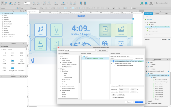
Axure in action.
Axure can easily get complex. Strict labelling of states and parameters is crucial.
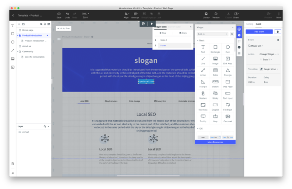
Users coming from Axure will feel quite familiar in Mockitt’s work environment.


Mockitt is a prototyping tool


Just like some designers do wireframes and design in Axure, you can go from idea to prototype in Mockitt alone. The tool comes with drag and drop components from common UI frameworks like iOS and Android, so you could easily build a complete UI for mobile, desktop or other platforms. But it’s not a UI design tool like Sketch or Figma. As with Axure, you’re quite limited in making beautiful, bespoke UI elements from scratch. It’s not a tool for production design.


Will I use it?


For years, my workflow has been Sketch + Invision, or Axure, or sometimes even Sketch + Axure. Mockitt could replace Axure, but from what I’ve seen it falls short if I want to build a heavily dynamic and interactive prototype. Apologies if I’m wrong – I haven’t dug very deep in my analysis.


How does it compare in pricing?


Here’s the thing. I own a license of Axure RP 8. It was a one-off purchase. Axure RP 9 is a subscription service, and so is Mockitt. Annually $300 vs $69. If I were to subscribe to one of these today, the much cheaper price tag on Mockitt is compelling unless I severely need the unique features of Axure.


But for $144 a year you can get Figma, which offers both design and prototyping. If you need a tool for production design to complement your prototypes this would be a better option. Or you can buy a one-off Sketch license for $99 and use it with Invision for $156/year.

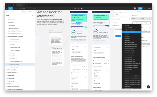
Figma offers a classic canvas environment that does both design and prototyping.
Invision in action.
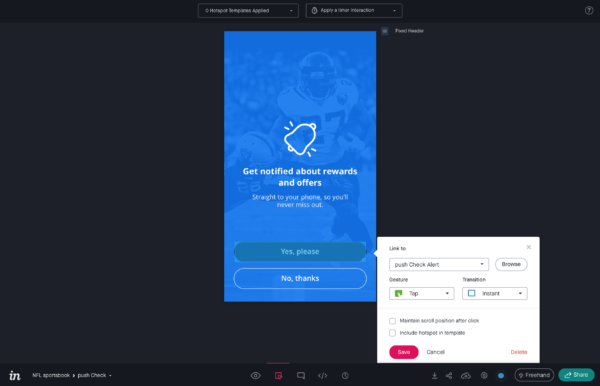
Invision is the most limited tool in the list, but is extremely easy to use for simple prototypes.


There are of course other factors to take into account. Collaboration, version control, compatibility with other tools, plugins, dev handover etc. What’s right for you and your team will eventually come down to your unique needs and preference.


All these tools; Sketch, Figma, Axure, Invision and Mockitt offer free and trial versions, so the best thing to do if you’re looking for the optimal tools for your workflow is to give them all a go, using a real world project to stress test all scenarios.

figma.com
sketch.com
mockitt.wondershare.com
invisionapp.com
axure.com